CommBank data visualisation toolkit
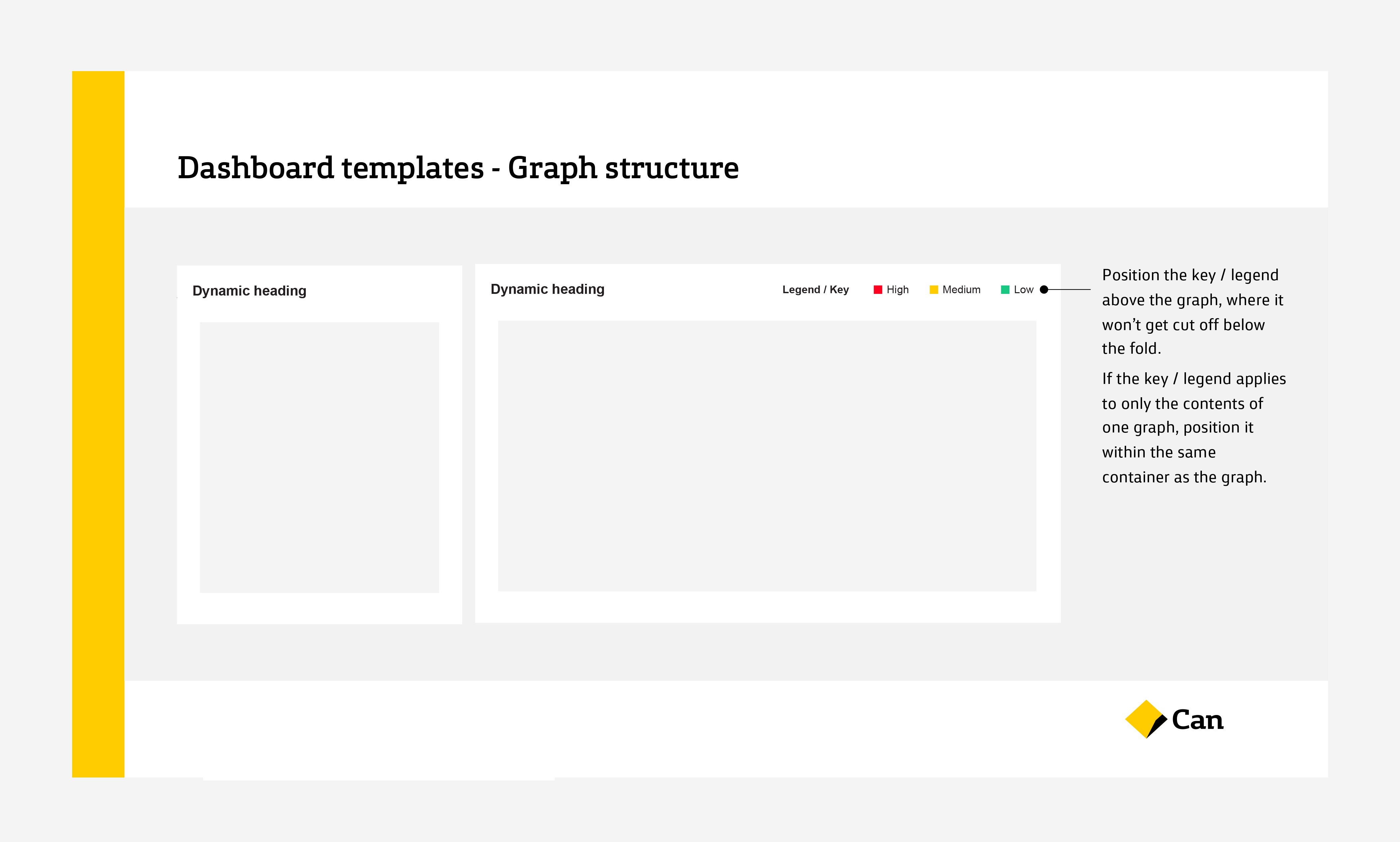
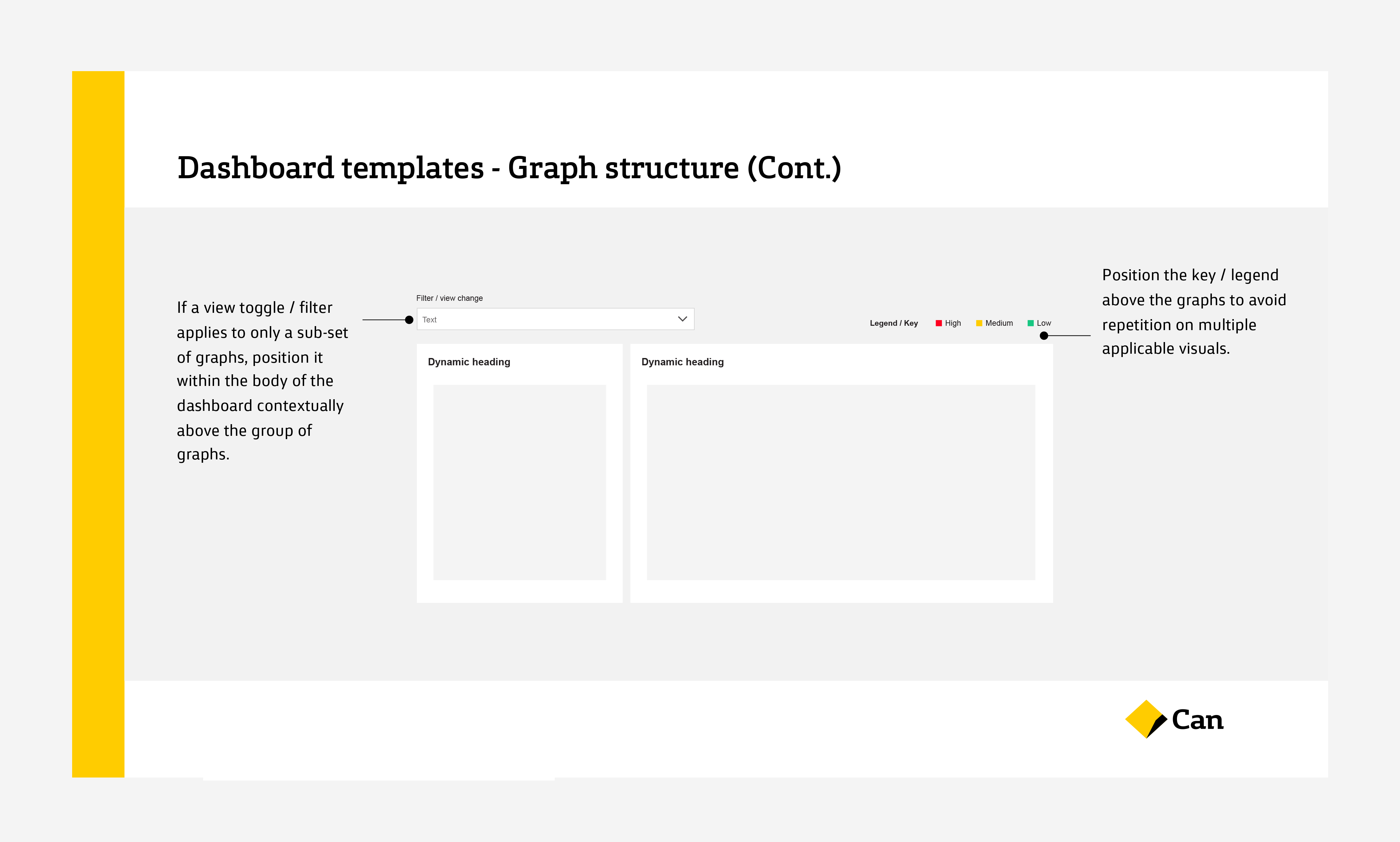
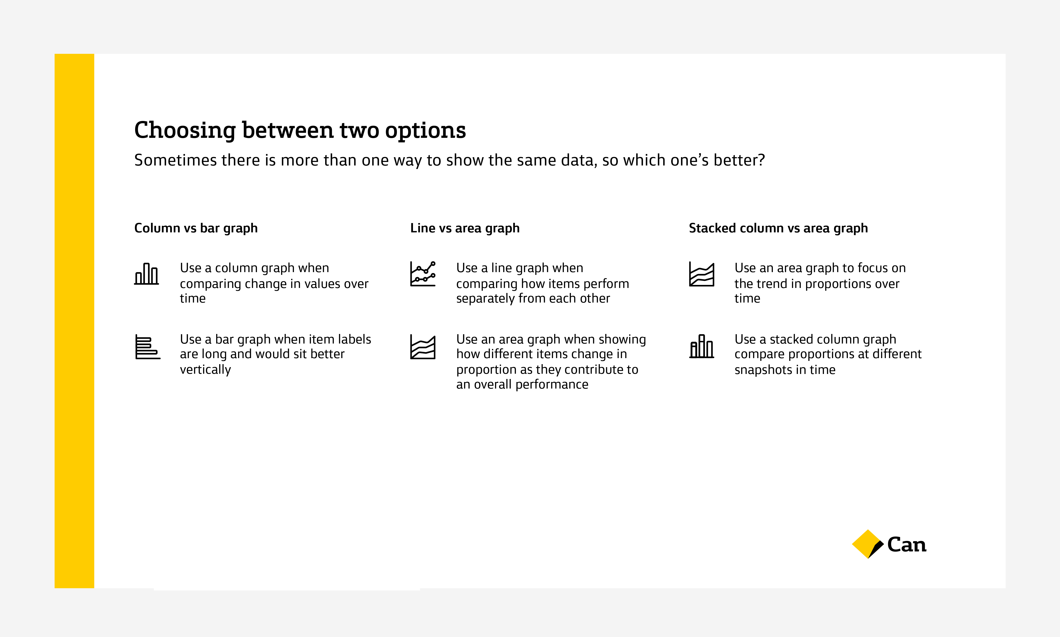
Data visualisation | UX & UI | Design educationWhile CommBank has been using reporting dashboards in many areas of the business, teams had been extracting data and generating graphs in silos. As part of an engagement with the Risk reporting team to re-design a series of Tableau dashboards for non-financial risk, our team was also tasked with creating a “data visualisation toolkit”. This artefact is used as internal design education to help different teams align and conslidate their approach to data visualisation agnostic of platforms and with consideration to both interactive and static visualisations, from the inital process of determining what data is actually needed, to the selection and detailed execution of the individual graphs.
As the data visualisation specialist on the project, I faciliated a series of workshops with my team to draw out the strategic intent of the program, analyse existing dashboards and gather requirements from creaters as well as users of the visualisations to create a set of personas with business stakeholders and, test the re-designed dashboards.
As the dashboards we created for the Risk team contained highly confidential data and information, and many sample graphs for applied usage of visualisations in the toolkit are also not for public sharing, this case study shows only sample pages containing best practice principles and guidelines.
As the dashboards we created for the Risk team contained highly confidential data and information, and many sample graphs for applied usage of visualisations in the toolkit are also not for public sharing, this case study shows only sample pages containing best practice principles and guidelines.


Client
Commonwealth Bank of Australia
Client
Deloitte Digital
Commonwealth Bank of Australia
Client
Deloitte Digital
Collaborators
Ann Layson
UX designer
Rhiannon Bunting
Content specialist
Alex Winiarski
Designer
Ann Layson
UX designer
Rhiannon Bunting
Content specialist
Alex Winiarski
Designer