AMP Goals-based advice experience
UX & UI | Data visualisation
One of Australia’s
largest financial institutions revamped their strategy for providing financial
advice, with a series of corresponding tools across different channels to bring
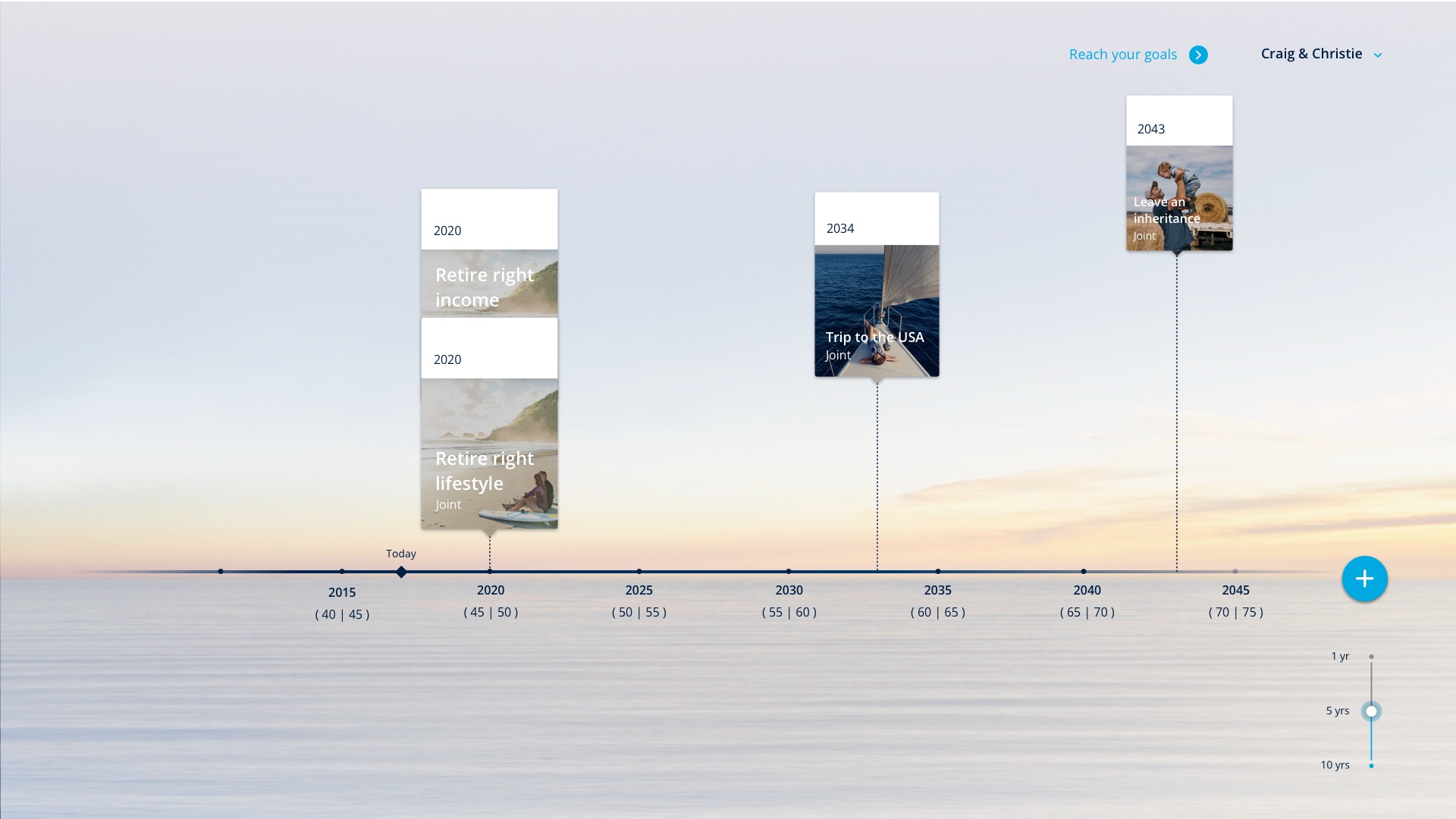
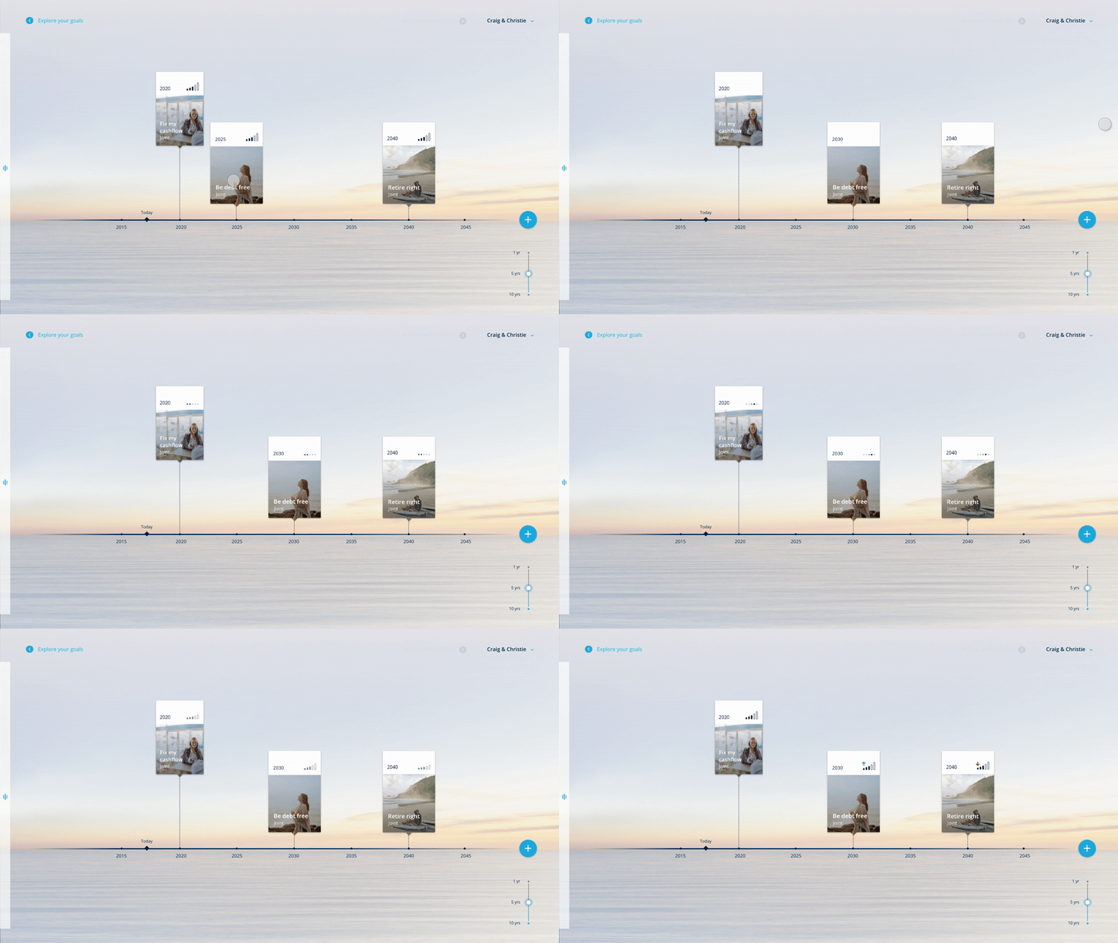
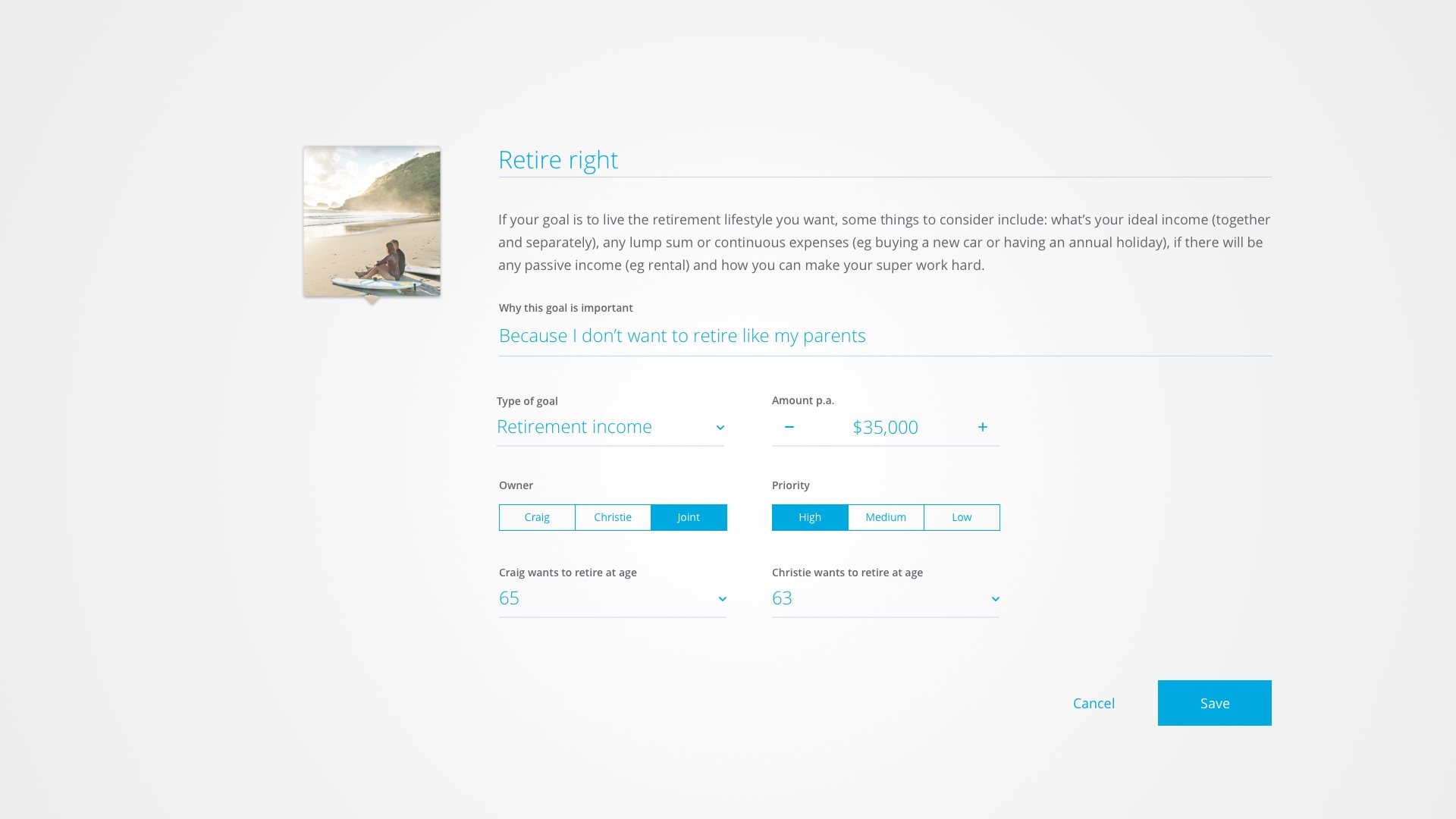
this offering to advisers and customers alike. This experience took a goals-based approach, that allows customers to select, define and prioritise their financial goals, to then discuss and plan the actions they need to take in order to achieve them.
As part of their extensive
growth transformation program, we worked in cross-functional streams
as designers imbedded in the client’s business to deliver these tools alongside
their in-house product teams and other external vendors. This required me to tie together
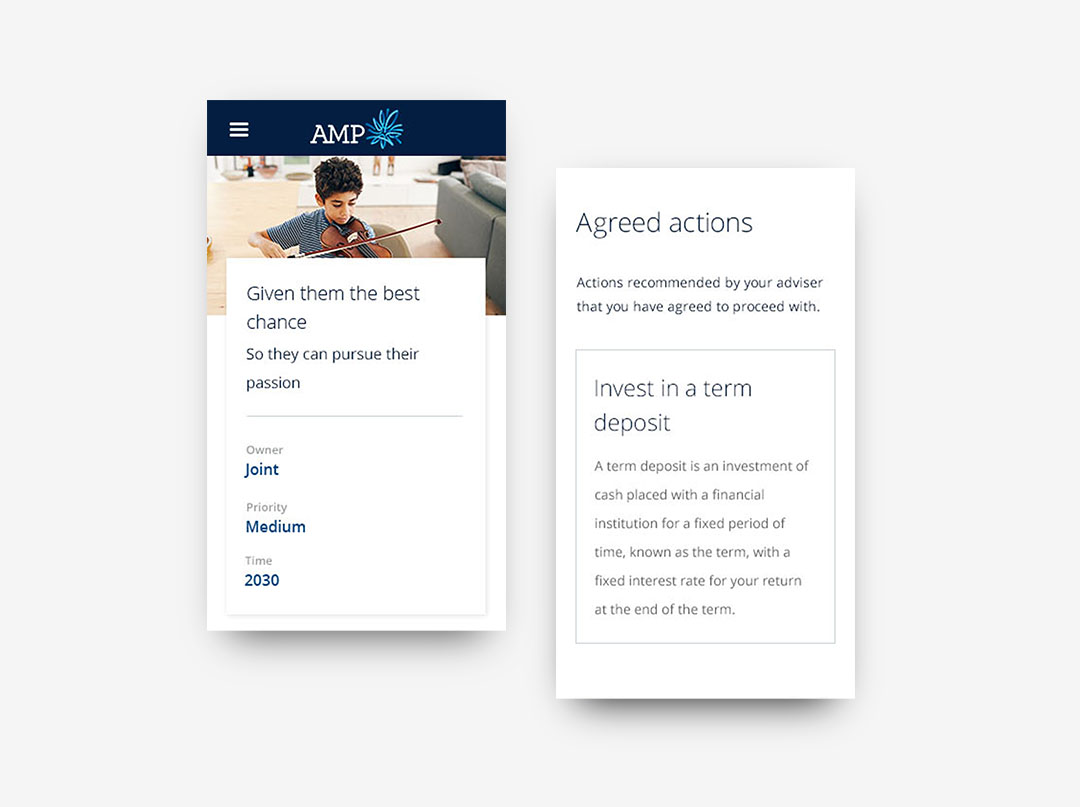
separate products on interactive store surfaces, desktop, mobile and print, to
embody a consistent but distinct style and convey the same data in a
meaningful manner.
The AMP Advice Explore won Gold the 2018 Good Design Awards for Best Digital Interface
The AMP Advice Explore won Gold the 2018 Good Design Awards for Best Digital Interface

Hope is on the horizon
Time and money are highly abstract concepts, so the value of financial advice comes in helping individuals to set up a concrete plan.
The horizon line as a far but visible direction served as an extended metaphor for the whole experience. We used associative imagery as backdrops to customer-facing exploration, and this visceral layer has received positive feedback in relation to the calmness instilled by the visuals.


Embedded into every product stream
To make tangible the
customer’s current position in their life, at least in financial terms, a
number of metrics were set up to measure data captured at different touch
points in the journey. By creating a holistic view of the customer’s lifestyle,
ambitions and personal confidence, the adviser can personalise their investment
approach to suit each individual. I worked
across seven inter-connected products over a span of twelve months, and moved
back and forth amongst them throughout the year.
We engaged with end
users as well as stakeholders on a frequent basis to co-design and test the
products with both customers and advisers. Workshops were set up to understand
people’s mental models, what drives their behaviour and what their expectations
are for the business and different technologies. We captured requirements and validated
assumptions with the users, from resonance testing visual concepts to determine
the creative direction of a new immersive experience, to guerrilla AB testing of
micro-interactions. Findings from different product streams were shared, not
only in relation to the UX, art direction and interface design, but the conceptual
models with which advice was pitched and explained to the customer.


Client
AMP Financial Services
Agency
Deloitte Digital Australia
AMP Financial Services
Agency
Deloitte Digital Australia
Collaborators
Anton Delen
UX design lead
Craig Parkinson
Art director
Tabitha Chan
Creative design lead (Goals Explorer)
Aylene Kozloff
Creative design lead (Digital Advise Summary)
Bryan Mew
UX designer
Anton Delen
UX design lead
Craig Parkinson
Art director
Tabitha Chan
Creative design lead (Goals Explorer)
Aylene Kozloff
Creative design lead (Digital Advise Summary)
Bryan Mew
UX designer