Diary to data
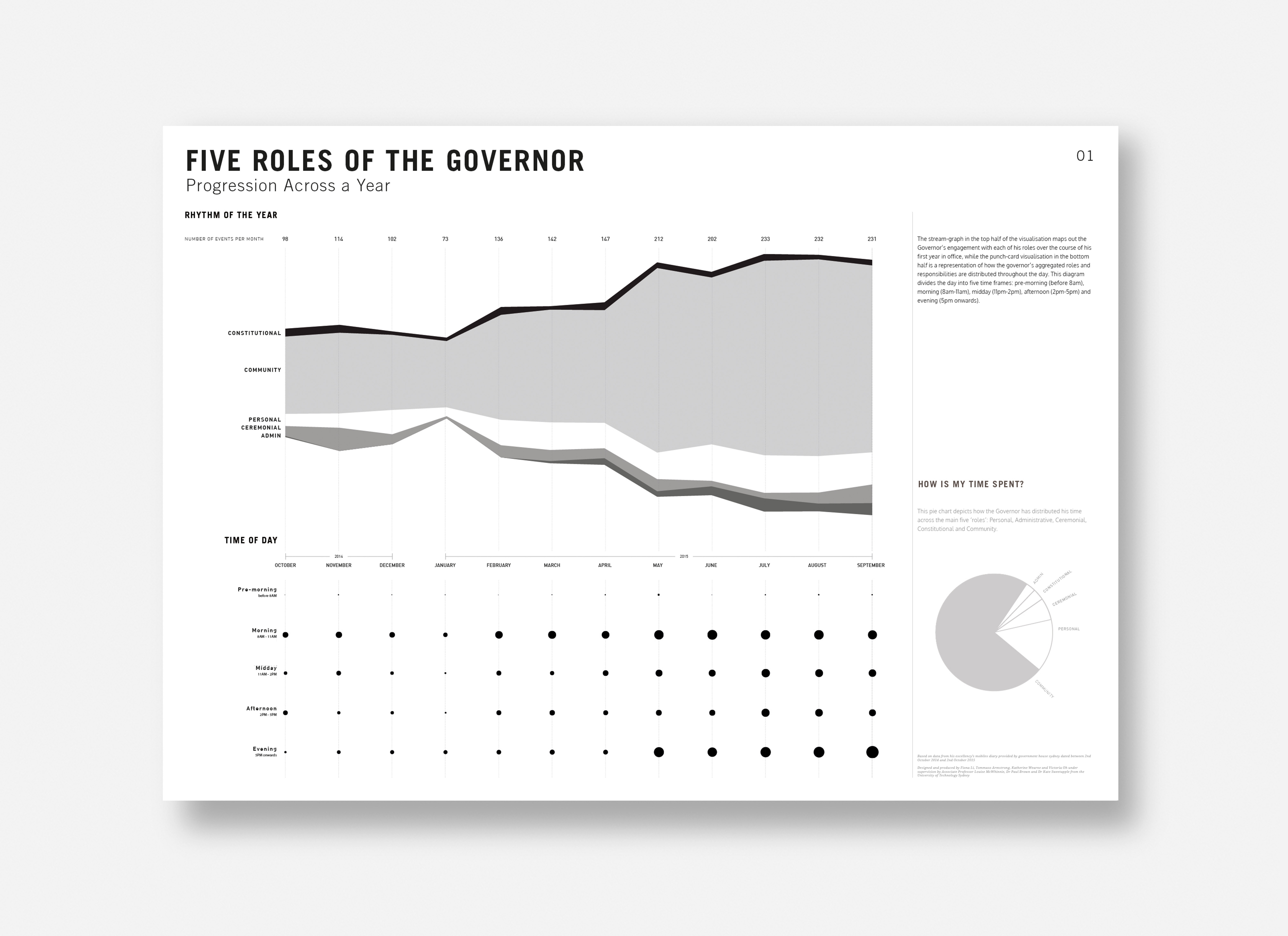
Data visualisation | Strategy | AnalysisThe Governor of New South Wales acts as representative and advocate for 7.5 million citizens of the state, fulfilling constitutional, ceremonial and communal roles along with necessary administration and personal time.
An inter-disciplinary team of UTS students was assembled to create a platform to analyse the Governor's engagements within the community. We visualised the data captured in the Governor’s diary from his first year in the role, to inform and consult the Governor on his next steps in achieving the ideal distribution of the his attention.
An inter-disciplinary team of UTS students was assembled to create a platform to analyse the Governor's engagements within the community. We visualised the data captured in the Governor’s diary from his first year in the role, to inform and consult the Governor on his next steps in achieving the ideal distribution of the his attention.
Week 1 & 2
Compiled and sorted the Governor’s diary from various formats into a holistic source of truth to identify themes, sub-themes and other categories of interest
Week 3
Prototyped possible visuals and formats to construct a comprehensive narrative, and decided on large format posters as the most accessible output for facilitating discussion between the Governor and his advisors
Week 4
Created final designs and presented to the Governor and his team at Government House
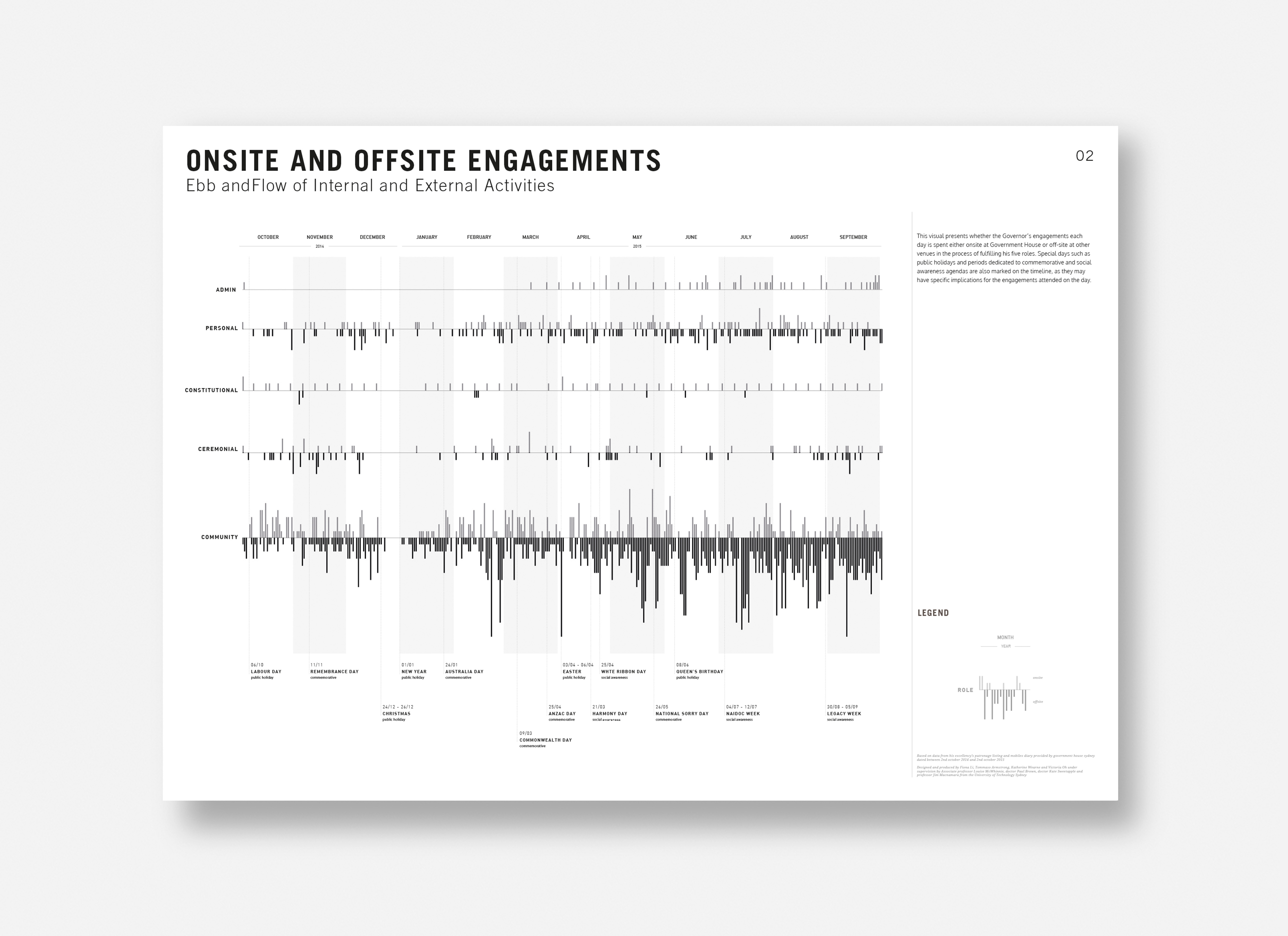
Onsite and offsite engagements
Government House, where the Governor lives and works, is an institution in its own right. Events and activities held here are an extension of the Governor’s engagement with the community.
This visual presents whether each of the Governor’s engagements in the process of fulfilling his roles is spent onsite at Government House, or off-site at other venues. Special days such as public holidays and periods dedicated to commemorative and social awareness agendas are also marked on the timeline, as they may have specific implications for events attended.
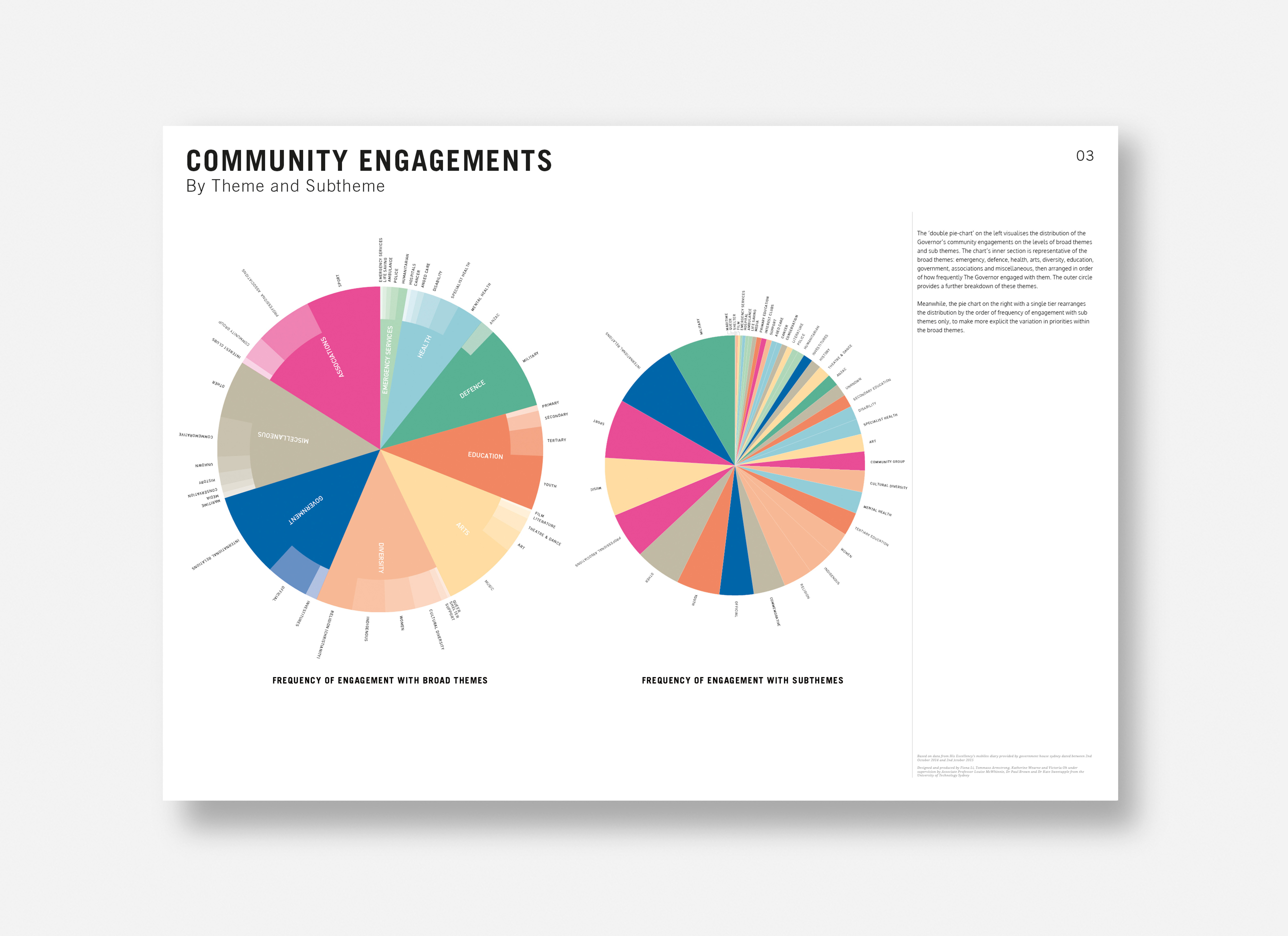
Community engagements
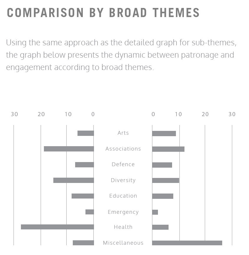
We identified eight broad themes which the Governor’s engagements could be grouped under, then realised that breaking those down to sub-themes yielded more useful findings.
It was interesting to note how despite a fairly even split amongst broader themes, the range of sub-themes within a broader category can differ greatly in the attention they recieved.
By also rearranging the distribution by the order of frequency of engagement with sub-themes only, we made explicit the difference in how varied a broader theme can be.
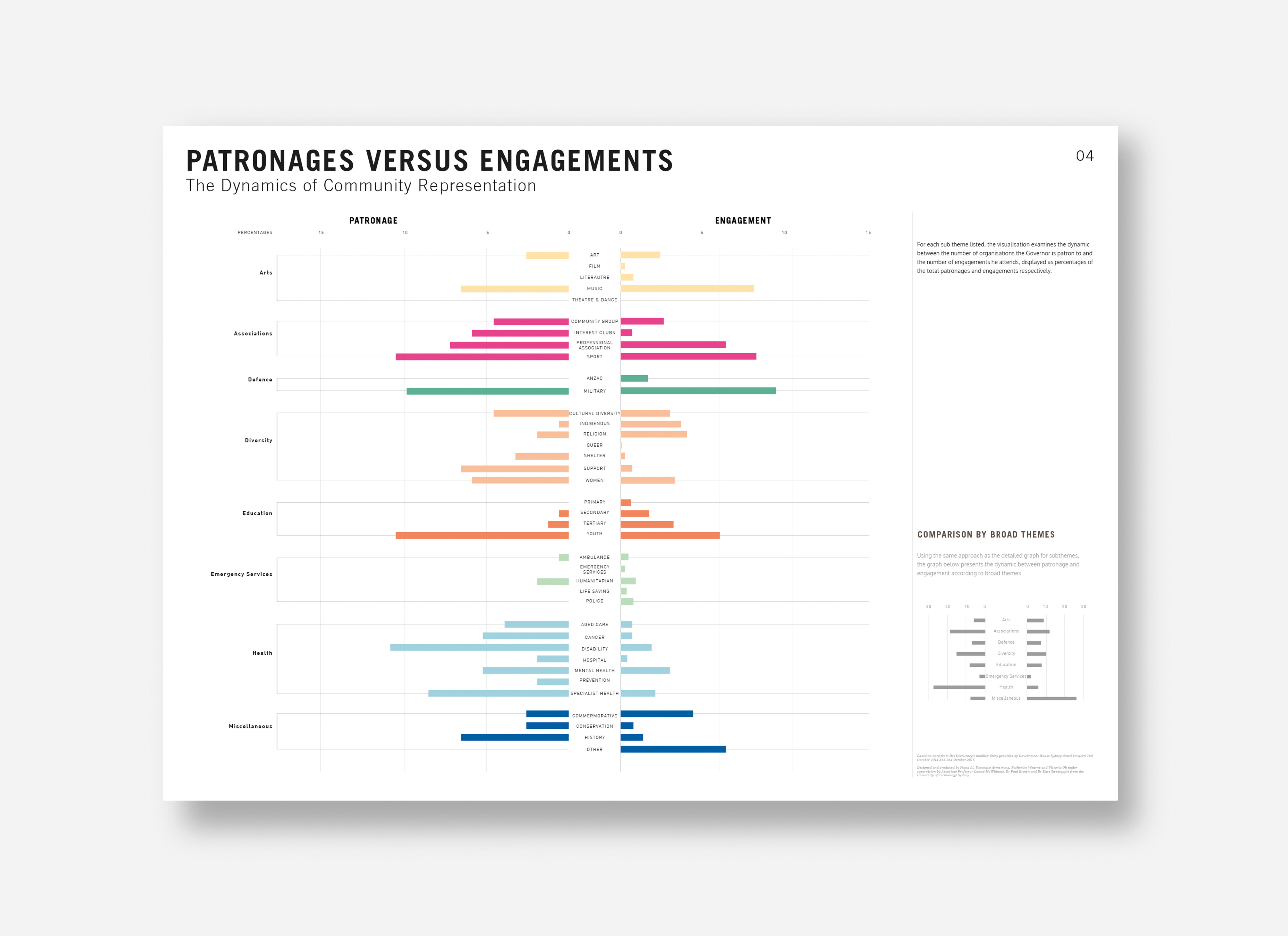
Patronages vs engagements
Engaging in person, and becoming a patron are the two main ways the Governor shows his allegiance to an organisation’s cause.
For each sub-theme listed, the visualisation examines the dynamic between the number of patron organisations and the number of attended engagements, to draw out the questions of which method would better aid his support of each theme.
For each sub-theme listed, the visualisation examines the dynamic between the number of patron organisations and the number of attended engagements, to draw out the questions of which method would better aid his support of each theme.
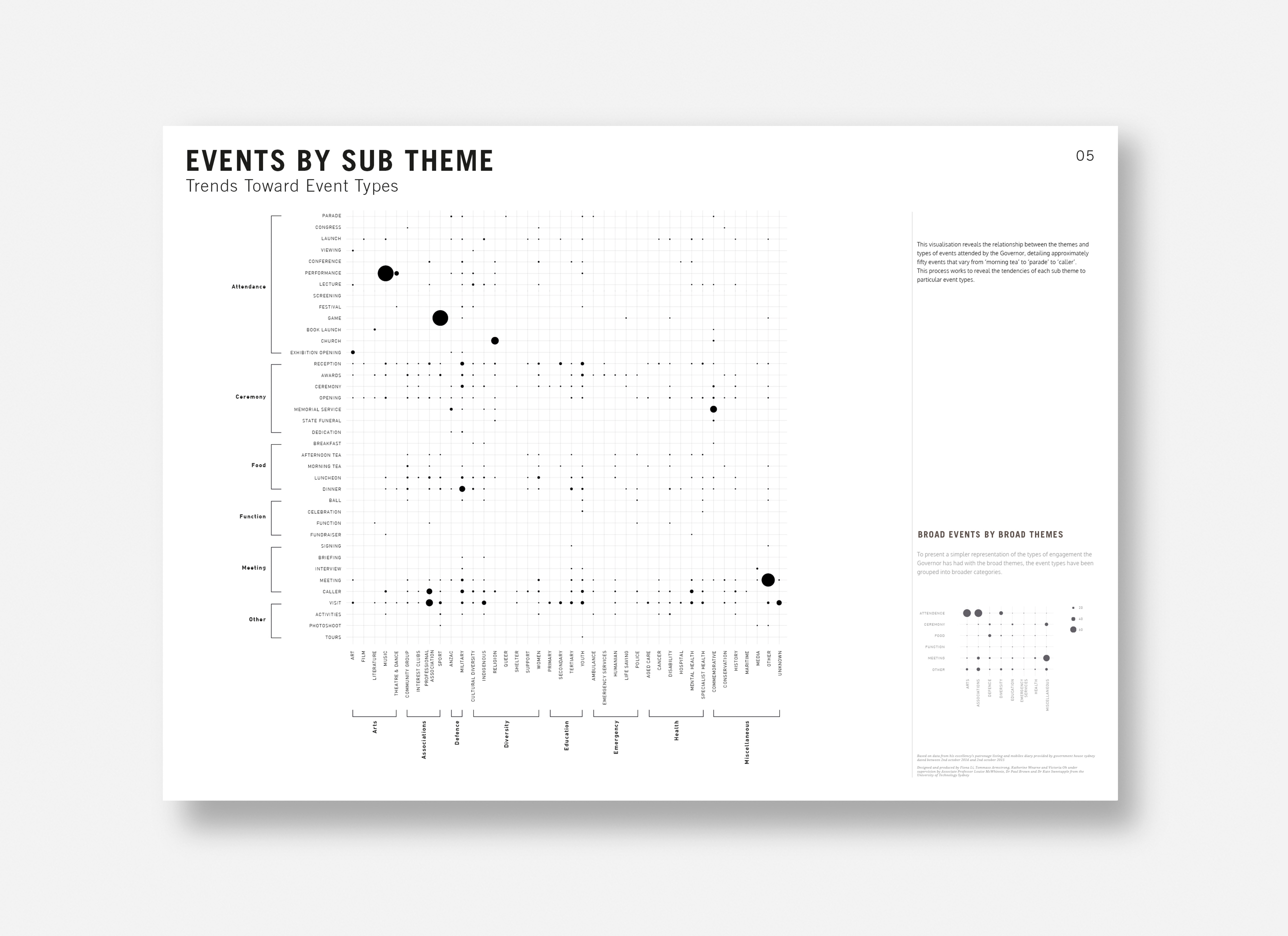
Events by sub-theme
This visualisation reveals the relationship between the themes and types of events attended by the Governor, detailing approximately fifty events that vary from ‘morning tea’ to ‘parade’.
This process reveals the tendencies of each sub-theme to particular event types, and may help the governor to prioritise his attendance to favour those that have less representation.

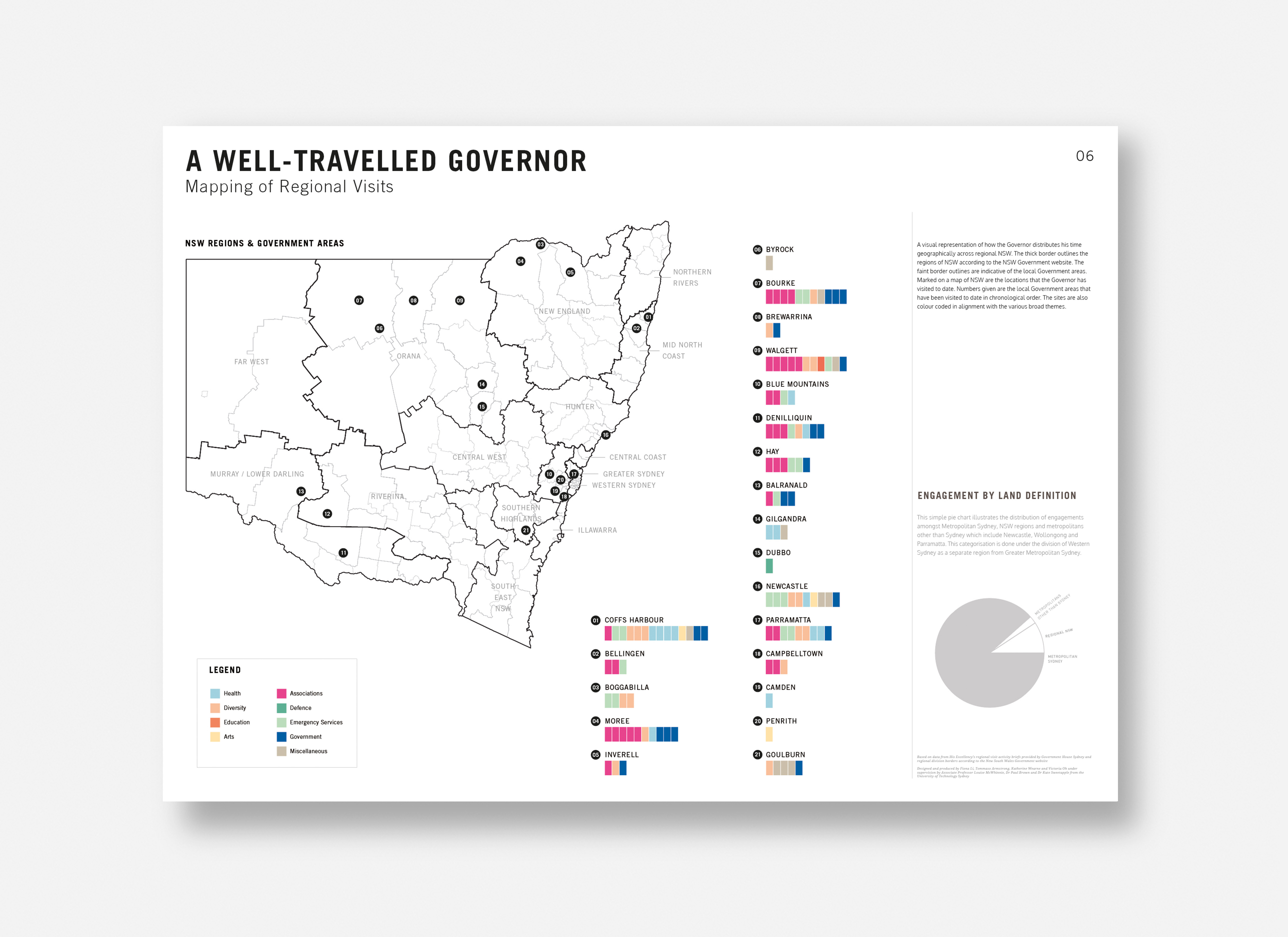
A well-travelled governor
A visual representation of how the Governor distributed his time geographically across regional NSW, the thick border outlines the regions of NSW while the faint border outlines are indicative of the local government areas. Marked on the map are the locations visited to date in chronological order, colour coded in alignment with the broad themes to show those that have been addressed.
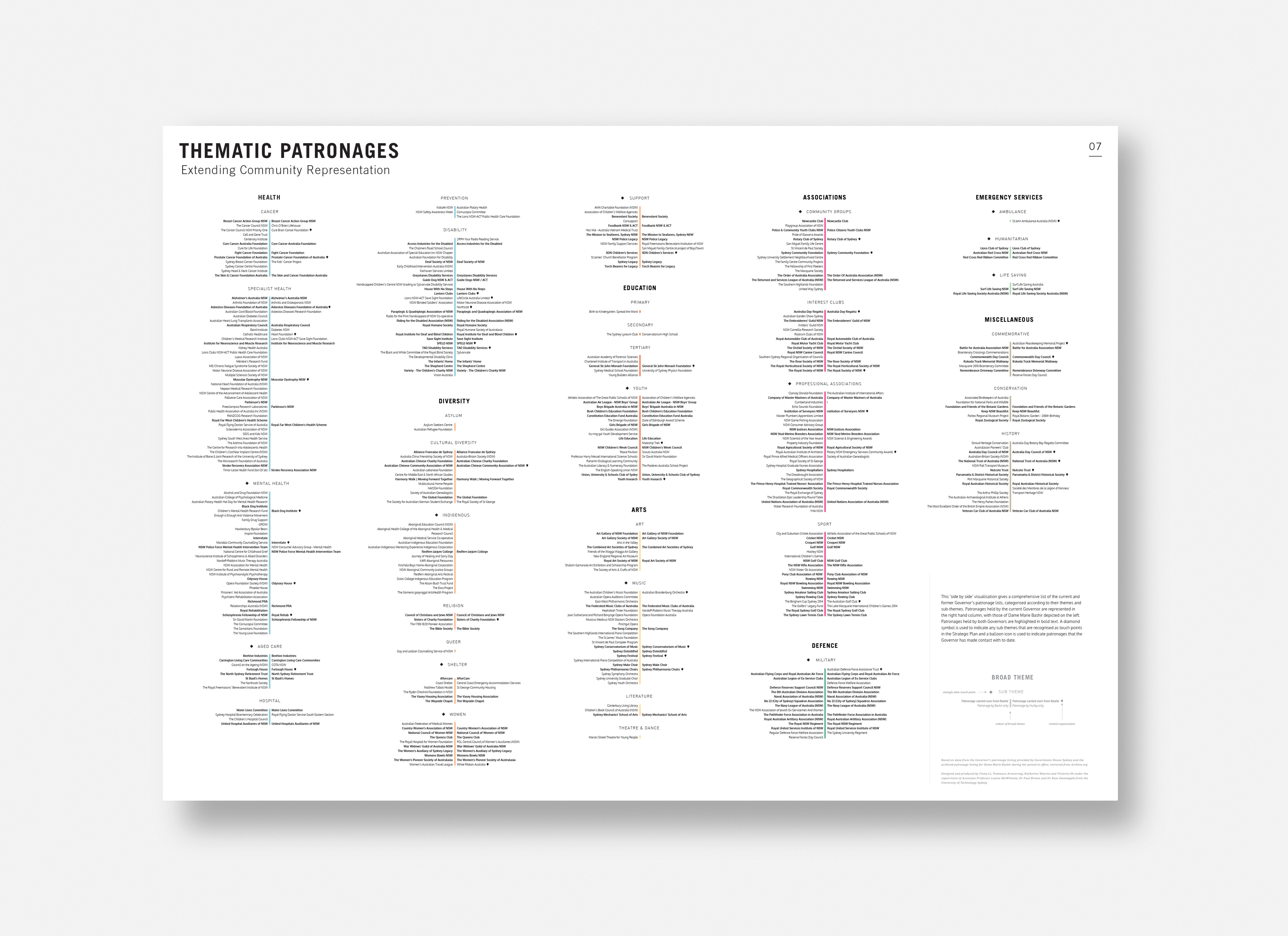
Thematic patronages
This comprehensive list of the current and former Governor’s patronage lists, categorised according to their themes and sub-themes, helps to identify the change in priotised themes between them, and highlight those held by both Governors.
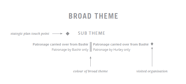
A diamond symbol is used to indicate any sub themes that are recognised as touch points in the Strategic Plan while a balloon icon is used to indicate patronages that the Governor has made contact with to date.
A diamond symbol is used to indicate any sub themes that are recognised as touch points in the Strategic Plan while a balloon icon is used to indicate patronages that the Governor has made contact with to date.
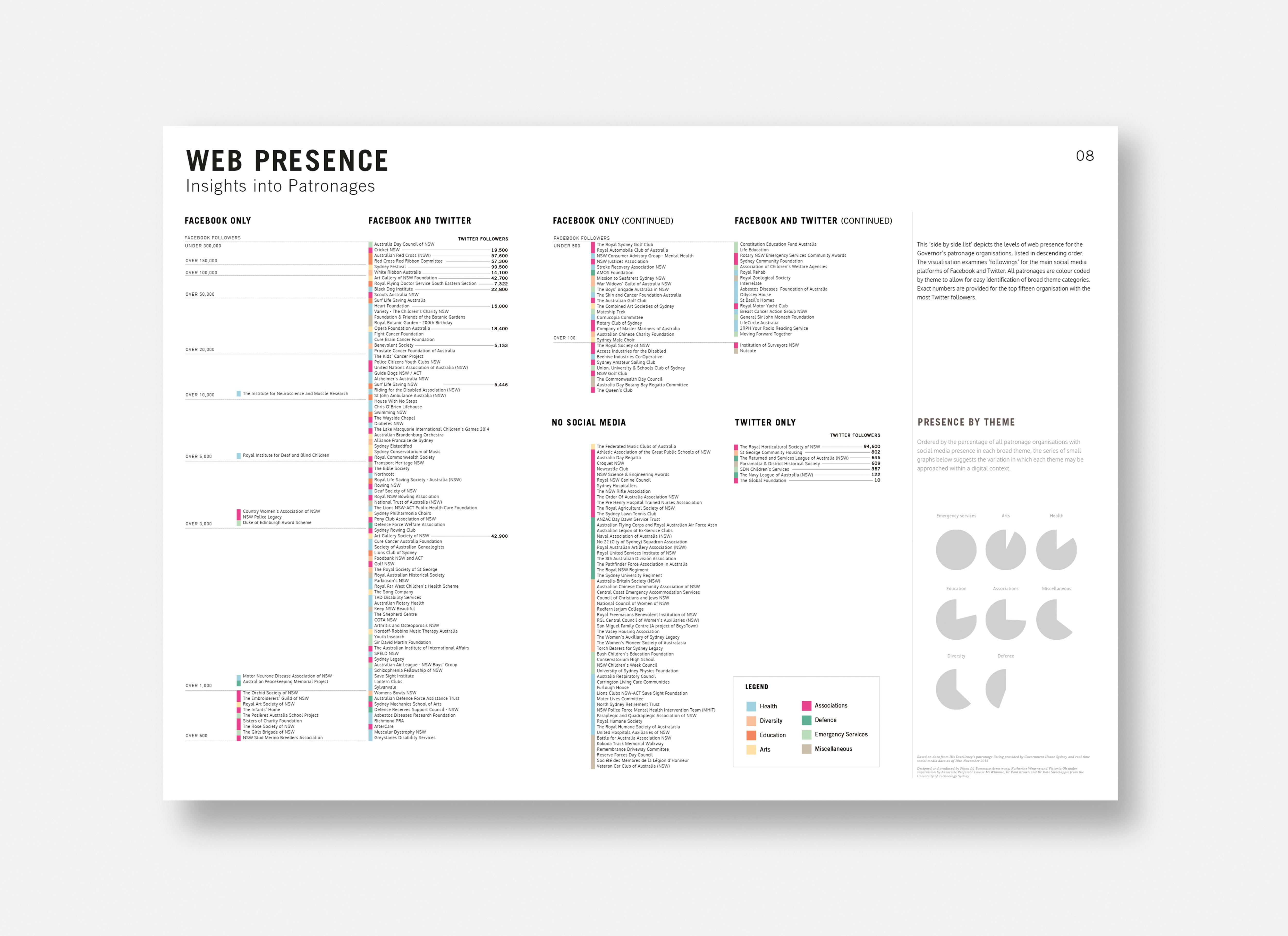
Web presence
The potential of utilising social media is suggested through the online presence of patronage organisations. As the Governor does not have capacity to manage an online social profile, appearing in posts made the by the orgnaisations themselves can still leverage the influence of these platforms to spread his message of support.
This visualisation depicts levels of following for the main social media platforms of Facebook and Twitter, to identity the most influential groups which he may approach via digital channels.
Client
Government House Sydney
Institution
University of Technology, Sydney
Government House Sydney
Institution
University of Technology, Sydney
Collaborators
Katherine Wearne
Social Inquiry / Creative Intelligence & Innovation
Tommaso Armstrong
Information Technology / Creative Intelligence & Innovation
Victoria Oh
Digital & Social Inquiry
Supervising academics
Associate Professor Louise McWhinnie
Dr Kate Sweetapple
Dr Paul Brown
Professor Jim McNamara
Katherine Wearne
Social Inquiry / Creative Intelligence & Innovation
Tommaso Armstrong
Information Technology / Creative Intelligence & Innovation
Victoria Oh
Digital & Social Inquiry
Supervising academics
Associate Professor Louise McWhinnie
Dr Kate Sweetapple
Dr Paul Brown
Professor Jim McNamara