Levitate
Branding | Hand lettering
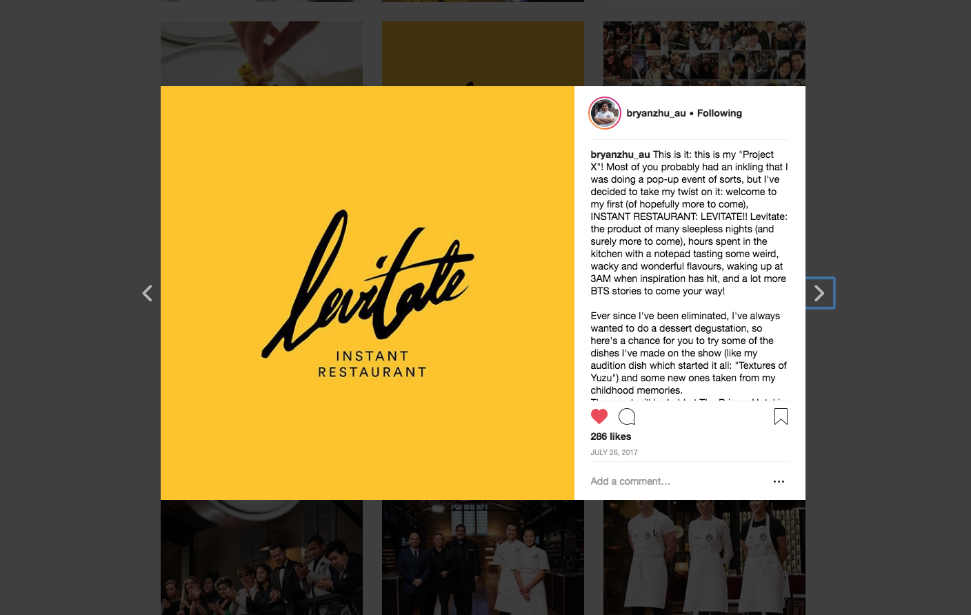
Brainchild of 2017 Masterchef contestant Bryan Zhu, Levitate was a concept-driven
pop-up restaurant that ran on select weekends to serve a 5-course dessert
degustation. His cooking style is highly experimental, merging traditional
Asian ingredients with contemporary methods to deliver unique fusion
compositions.
As the pop-up was the
first of his attempts to formally bring his recipes to the public,
a distinct identity was required to introduce and promote this up-and-coming
culinary master. Bryan decided on the name ‘Levitate’ to both reference the Ice
Cream Float challenge that lead to his exit from the show, and imply the uplifting
experience the meal would provide.
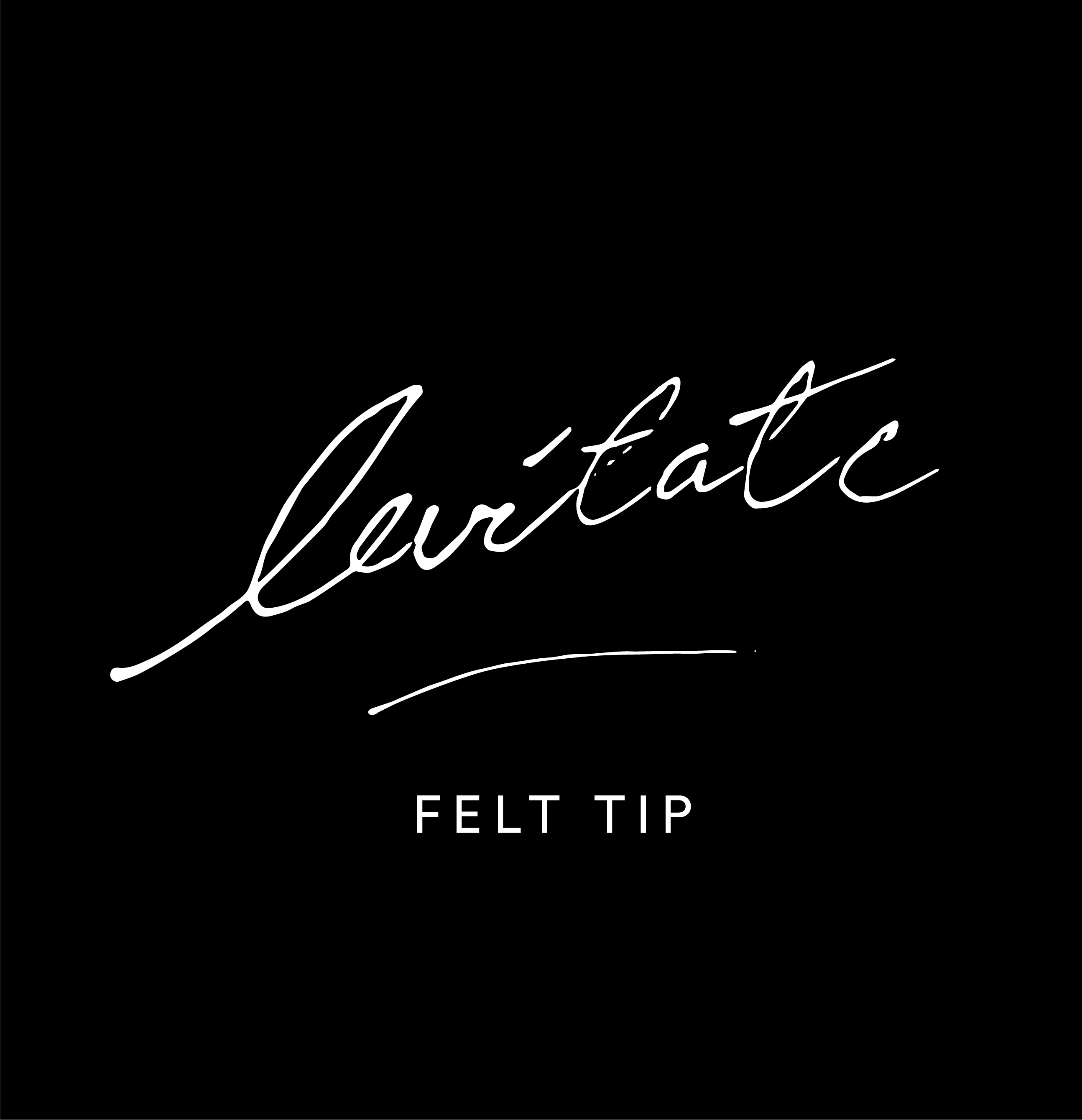
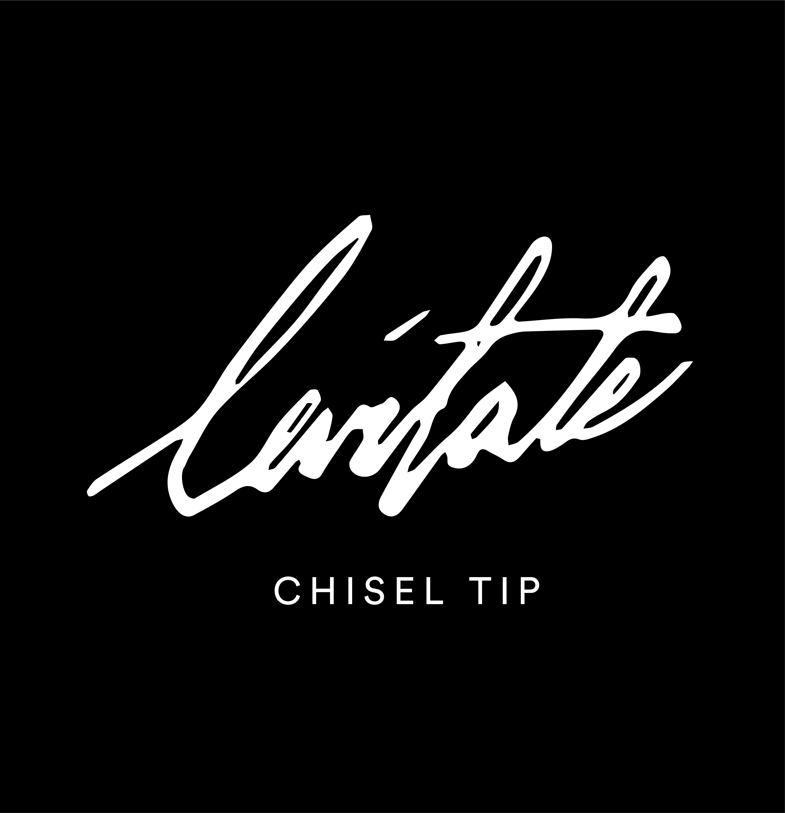
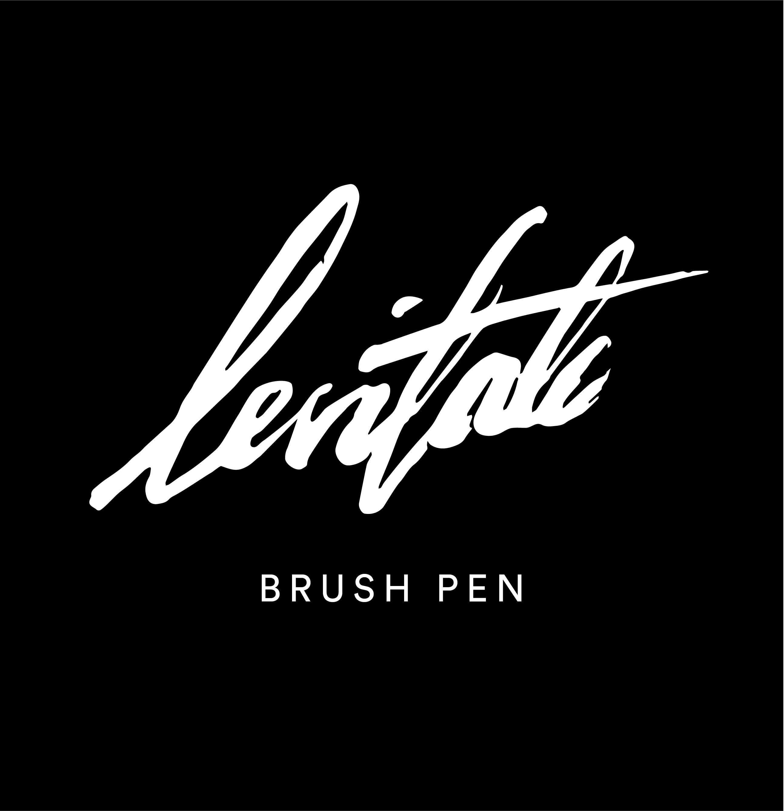
Freehand precision
Much of the Bryan’s creative flair is shown in the plating of his desserts, as careful arrangements mixed with deconstructed flourish. Another part of his creative process is drawing the dishes as they could be constructed, listing out the ingredients and sketching what the dish would look like at different angles.
Thus a hand-rendered approach naturally felt appropriate. After trying various tools and writing styles, the varied modulation of a brush was chosen as most expressive of the brand’s personality and ambitions, with the calligraphic style drawing back to east Asian flavours.

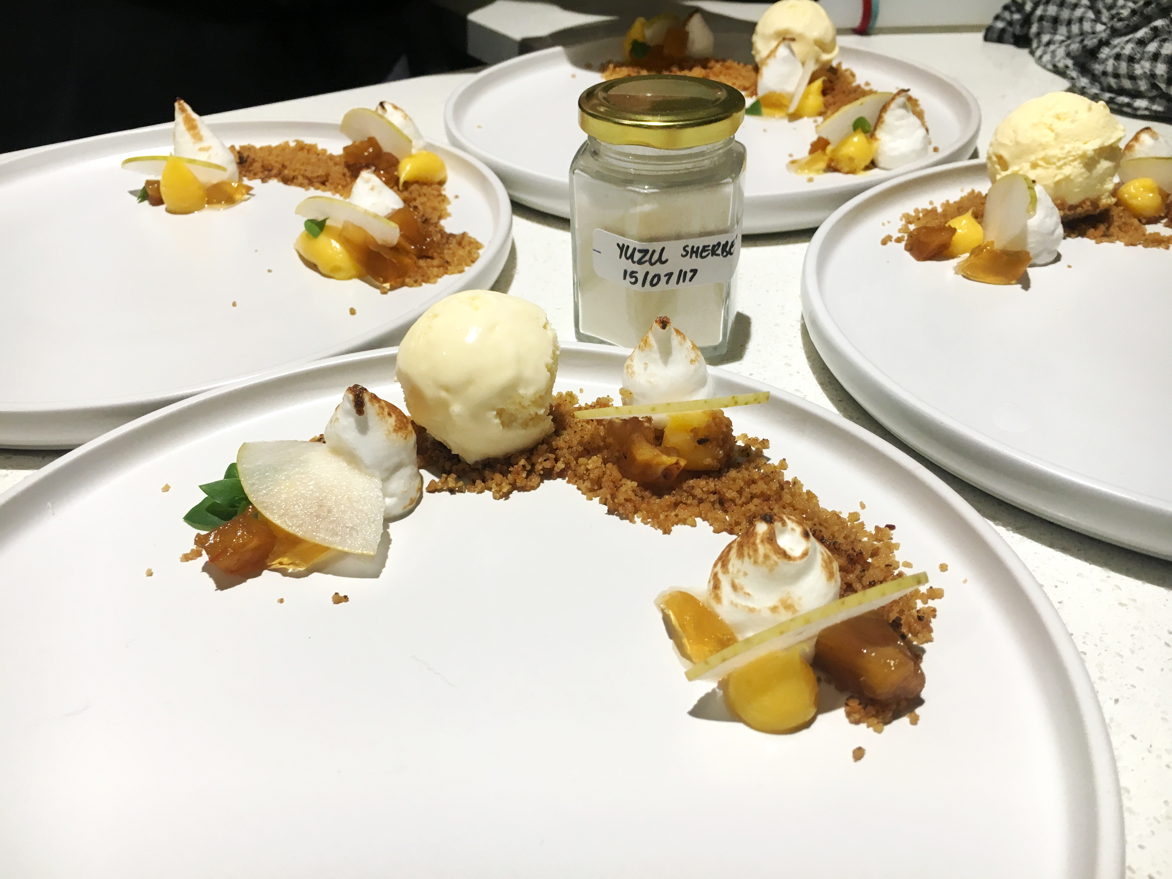
Textures of yuzu
Yuzu yellow is Levitate’s primary colour. The golden Japanese fruit makes a frequent appearance in Bryan’s dishes, its flavour as much a signature of his style as its colour is. Warm and bold, the yellow is inviting while confident in its excitement for pushing boundaries.
‘Textures of Yuzu’ was Bryan’s qualifying dish for the Masterchef white apron, and has since transformed into different variations.


Client
Bryan Zhu