Lion Marketplace
UX & UI | Product designLion Co is a leading beverage company primarily operating in Australia and New Zealand, with a growing presence in the UK and US markets, and a portfolio of brands that encompass a broad range of alcoholic and non-alcoholic beverages from Australia, New Zealand and the world.
With a history of 180 years, Lion takes pride in its products and experiences offered to the community of customers and consumers alike. Lion’s Digital Solutions team was formed to address customer needs within its global remit, to bring joy to every digital experience and help Lion and its partners succeed online.
With a history of 180 years, Lion takes pride in its products and experiences offered to the community of customers and consumers alike. Lion’s Digital Solutions team was formed to address customer needs within its global remit, to bring joy to every digital experience and help Lion and its partners succeed online.
I joined as the second hire in our in-house digital product design team. My first 5 months as the senior product designer was focused on Lion Marketplace, a B2B ordering solution. We used a design-led approach to discovery and delivery, where I scripted and conducted customer interviews, surveys and testing sessions, designed and prototyped solutions, facilitated co-design and technical validation jams, synthesised and played back findings to internal stakeholders, while also creating Lion’s first design system.
This process laid the foundation for other e-commerce products and experiences to be delievered by the Digital Solutions team.
The product won the 2022 Good Design Awards for Best Commercial Service.
Visit the Marketplace landing page: http://my.lionco.com/
This process laid the foundation for other e-commerce products and experiences to be delievered by the Digital Solutions team.
The product won the 2022 Good Design Awards for Best Commercial Service.
Visit the Marketplace landing page: http://my.lionco.com/
Lion’s digital brand evolution
As the core brand of both Lion and Little World Beverages were originally designed for traditional print and static collateral, adjustments were made to meet accessibility requirements of digital products and experiences.
I created a series of stylescapes to explore what we wanted the tone and personality of Lion’s digital brand to be, testing typographic treatments, imagery and approaches to layout. Themed by the look of light at different times of day, I tested how bold and dark, or light and airy, our look should be. The approach we landed on was the ‘golden hour’, which has a strong focal direction, but is neither harsh nor soft in how it presents the subjects on the page.
I created a series of stylescapes to explore what we wanted the tone and personality of Lion’s digital brand to be, testing typographic treatments, imagery and approaches to layout. Themed by the look of light at different times of day, I tested how bold and dark, or light and airy, our look should be. The approach we landed on was the ‘golden hour’, which has a strong focal direction, but is neither harsh nor soft in how it presents the subjects on the page.
For unauthenticated, public-facing interfaces, the type stack provides an editorial feel to the stylised, rich content. Whereas for authenticated B2B products that serve transactional purposes, a less stylised type stack is used to maximise legibility and conserve screen real estate for scanability.
The digital palette included colour variations as user feedback for interactions, tweaked for better colour contrast. While the iconic Lion Orange is retained as the hero brand colour on public-facing experiences, it’s used more sparingly on transactional tools to call out deals and special offers, with the less aggressive primary green as the main interaction colour.
The digital palette included colour variations as user feedback for interactions, tweaked for better colour contrast. While the iconic Lion Orange is retained as the hero brand colour on public-facing experiences, it’s used more sparingly on transactional tools to call out deals and special offers, with the less aggressive primary green as the main interaction colour.


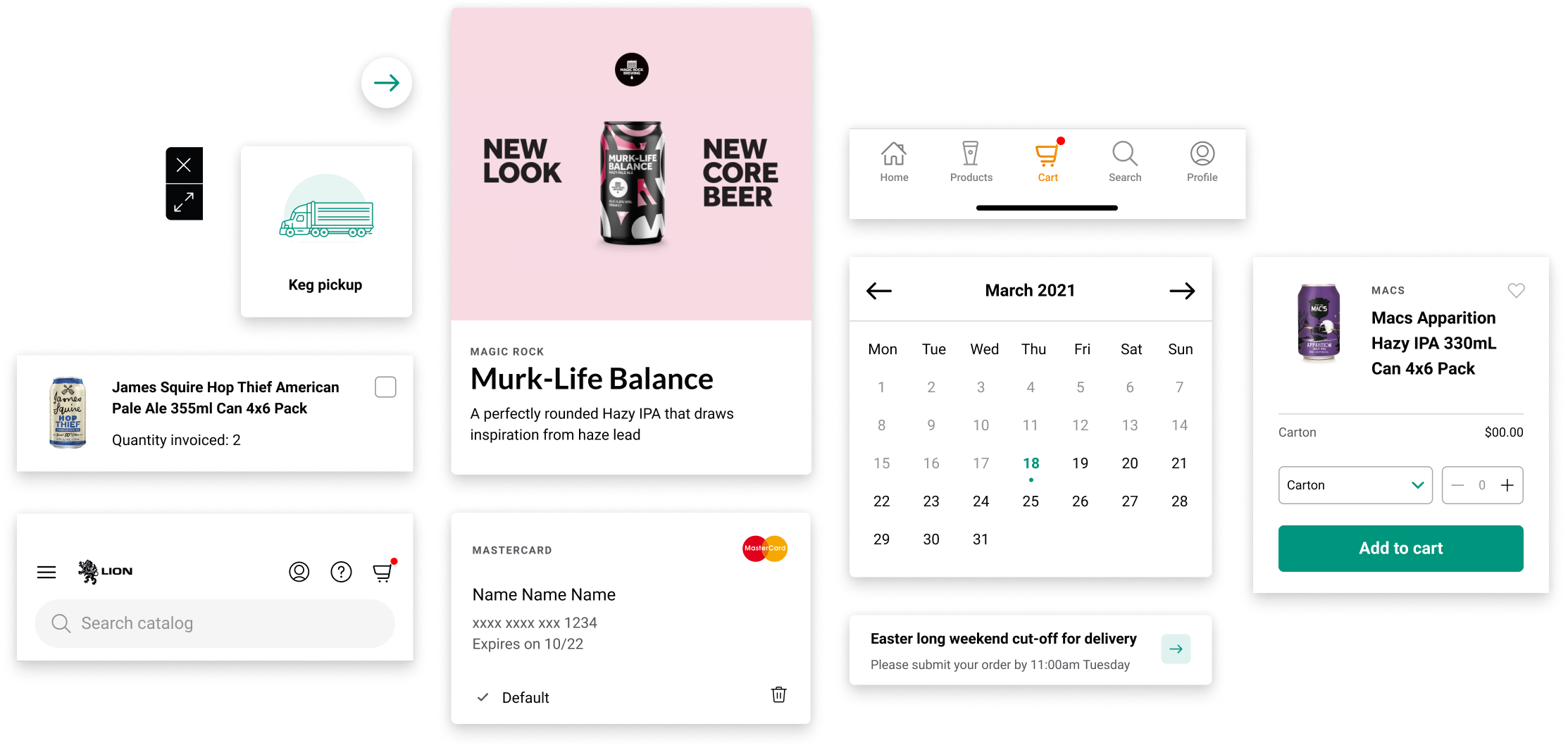
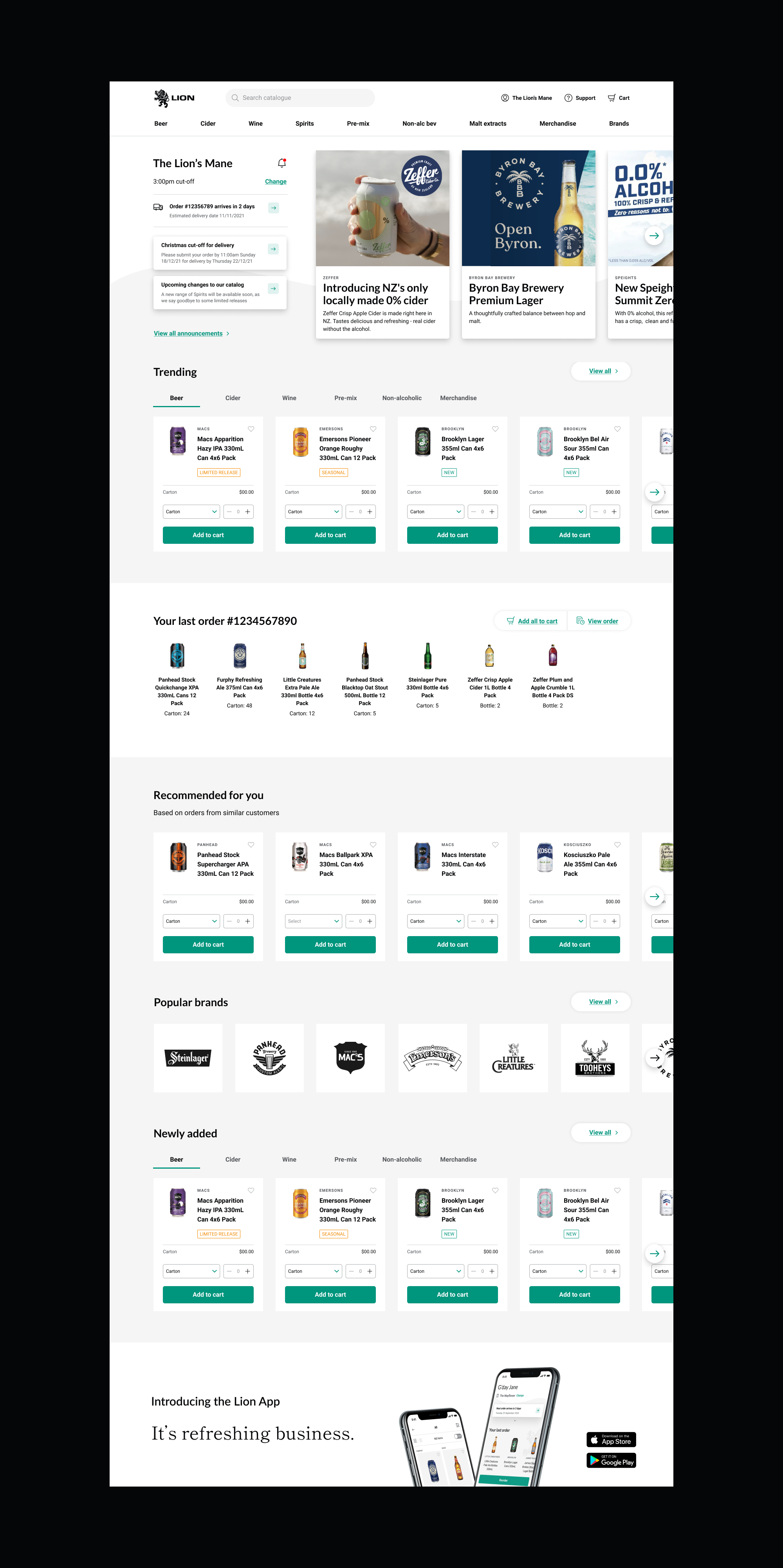
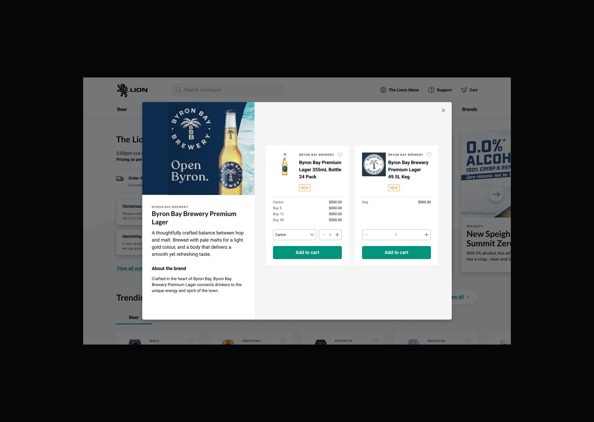
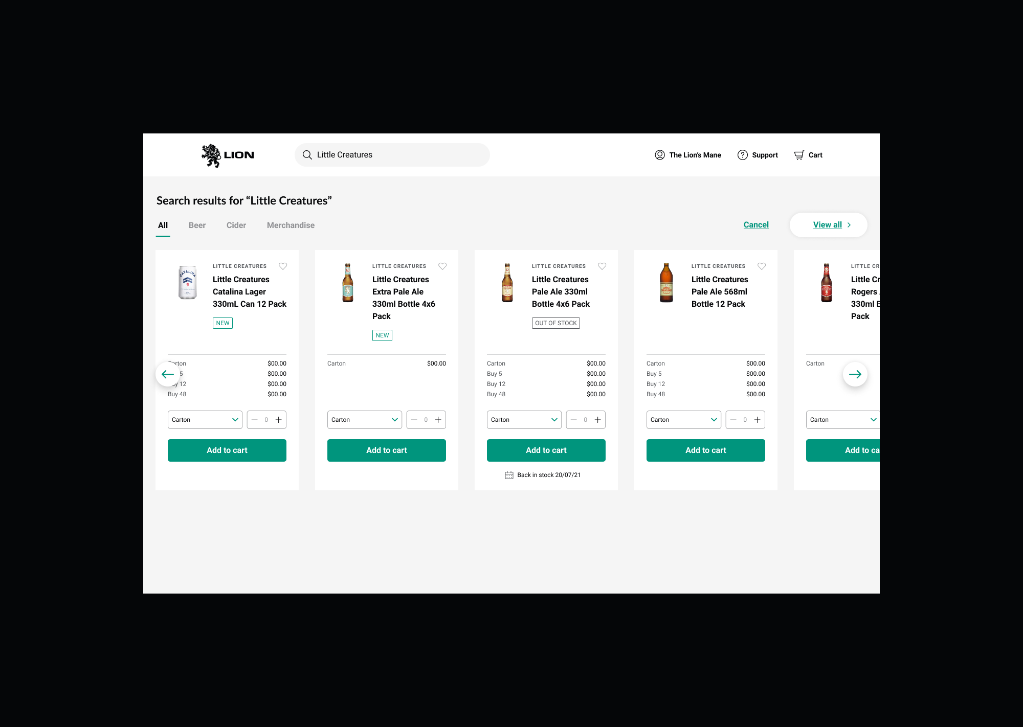
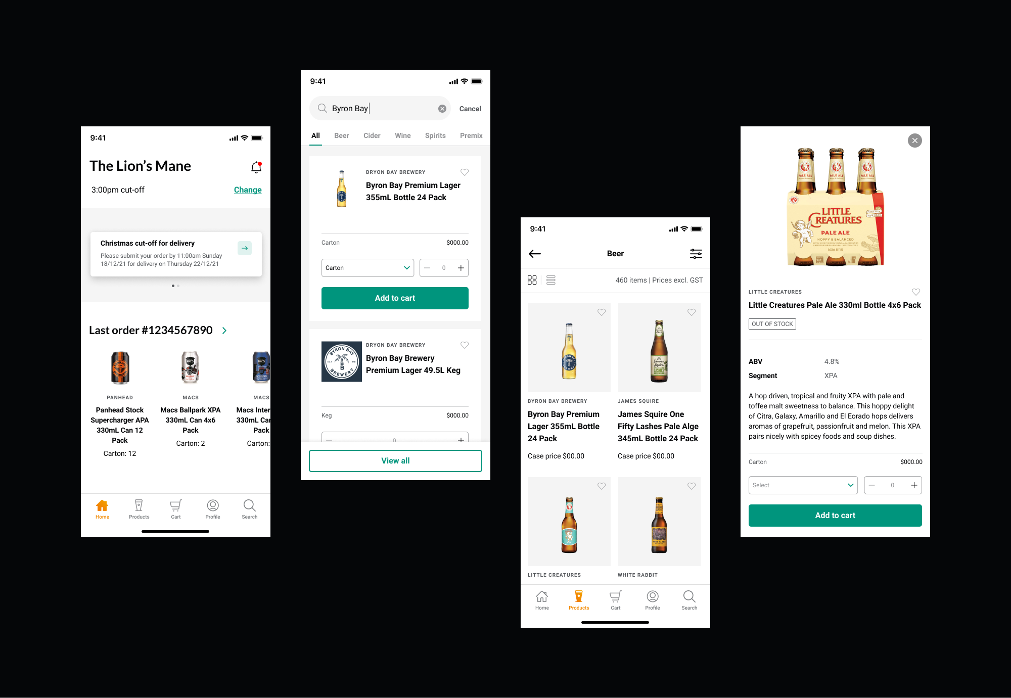
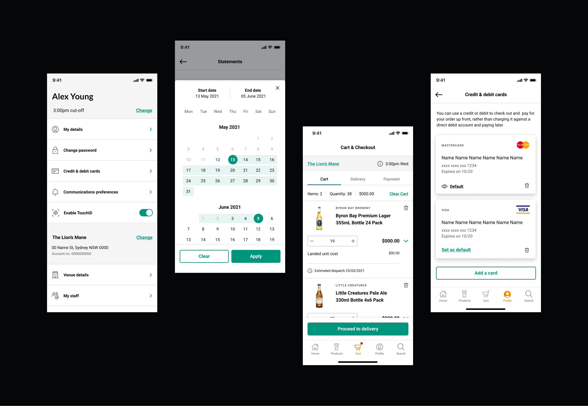
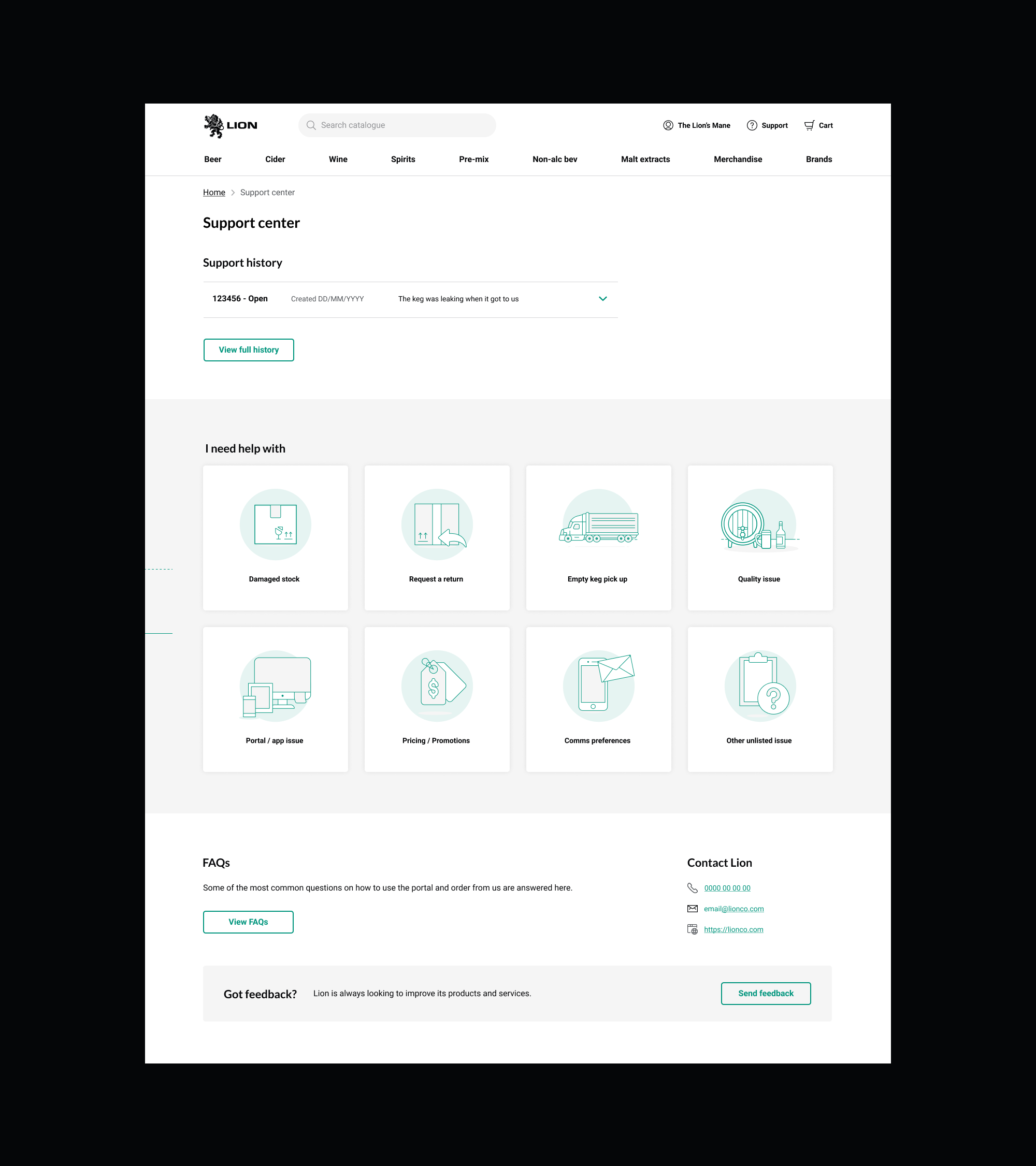
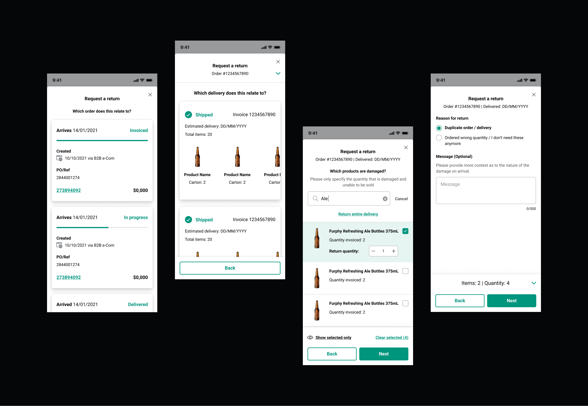
Marketplace portal and app
These days, most FMCG businesses have a some sort of customer self-service digital platform. While Lion had an existing portal built on SAP Hybris, we needed something that allowed customers to access the data they wanted, when they wanted it, where they wanted it, and in a format that they could consume.
We built an app so that customers could place orders and manage their Lion account from anywhere, at any time. And while it excited many of our customers, a large portion told us they would still need, or prefer, to use a web portal to complete large orders on a shared computer in the back-office of their pub. So we delivered both at the same time, leveraging existing back-end frameworks and APIs, but built our own front-end.

Digital product design process
Discovery interviews
We interviewed a variety of on-premise hospitality venues and off-premise retail customers, as well as internal stakeholders such as Sales team members from Australia and New Zealand. This was to uncover unmet needs and test assumptions, understand what roles existed in their business, their internal processes, and what pain points they had with the existing customer portal.
Collaboration sessions
We converted customer needs, goals and pain points into features for our product roadmap and improved information architecture. Through a series of design jams, technical validation sessions and stakeholder reviews, we iterated on initial concepts and prioritised the backlog.
Test and learn
We asked our customers who had differing levels of tech proficiency to test our designs using interactive prototypes and Treejack tests. Once we had taken their feedback on board, we created a pilot group for a soft launch of the built product, to test and iterate with a live version of the tool.
Continuous improvement
Since the initial launch of the app and portal, we have been collecting feedback from customers, sales team members and other subject matter experts from various parts of the business. We have also been revisiting existing features to consider how they can be done better, even if it’s purely on the UI level to improve the micro-interactions and streamline the management of front-end code.

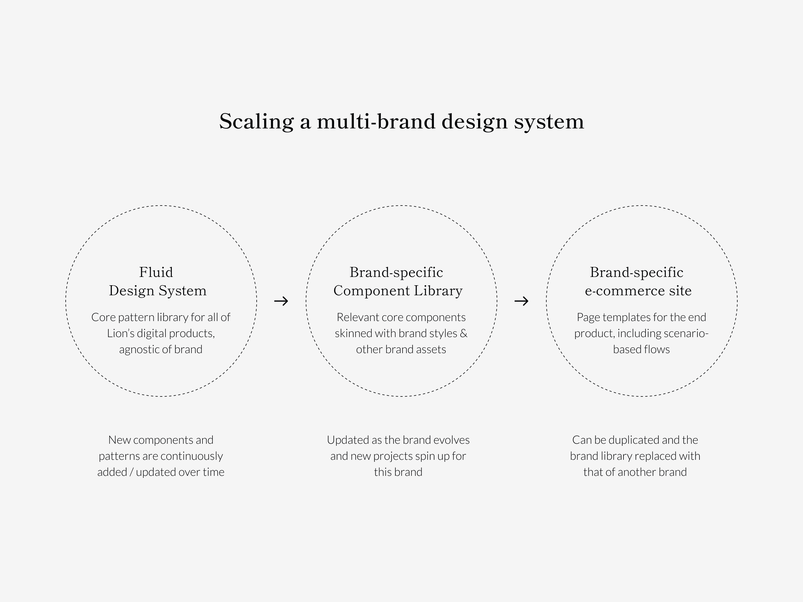
Fluid design system
I created Lion’s Fluid Design System in Figma, to manage design at scale with reusable components and patterns across web and mobile. We continously update our components to integrate platfrom differences between app and web, and use case differences between B2B and D2C.
Lion is a house of brands, and different parts of the business came from the acquisition of well-known distributors and breweries across the world. By creating a design system on which separate brands can be applied to existing components, Fluid allows us to rapidly deliver new and additional digital products that are managed within the same ecosystem.

Company
Lion Co
Team
Lion Digital
Lion Co
Team
Lion Digital
Collaborators
John Hayles
Digital design & UX lead
John Hayles
Digital design & UX lead