Shippit
Product design | UX & UIShippit is a B2B SaaS company in logistics that aggregates carrier services, e-commerce platforms and order management systems into an all-in-one platform. Originating in Australia, Shippit had been scaling up its presence in Southeast Asia and New Zealand.
I joined the 3-person team of senior product designers at Shippit to work with multiple squads on cross-functional initiatives to grow into new shipping niches, localise to international markets, and improve existing offerings.
I joined the 3-person team of senior product designers at Shippit to work with multiple squads on cross-functional initiatives to grow into new shipping niches, localise to international markets, and improve existing offerings.
We conducted contextual enquiries to carrier depots as well as retail stores and warehouses, to understand the physical and operational needs of different user personas. We interviewed, piloted and tested proofs of concept with internal SMEs and users across a range of business types for potential strategic pivots and investments. And in the process of detailed design for delivery, we worked with stakeholders in product, engineering, support, commercial and marketing to build and launch new features and services in market, then monitor its adoption and usage.
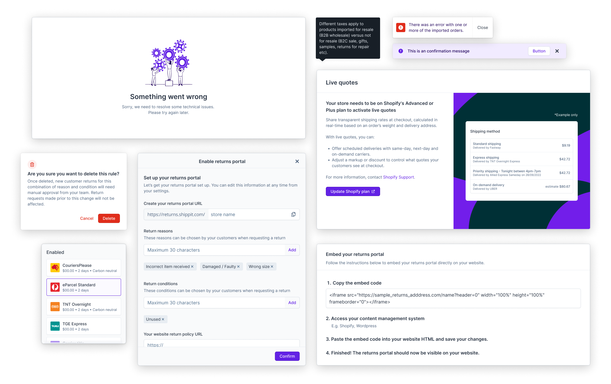
Expanding into new markets
I joined Shippit just as the New Markets portfolio was formed to relaunch Shippit in Southeast Asia, starting with Singapore, then Malaysia six months later. The team worked on localisation uplifts to the app such as payment methods (e.g. digital wallets), addressing, and carrier options. We also drove larger initiatives on shipping niches such as international shipping and on-demand, which was more common, profitable and necessary in the region than it was to most of Shippit’s Australian customers.
Thus it became ever more necessary to standardise but also increase flexibility of foundational patterns, such as currency and address formats. Shipping niches required order details and settings templates that only disclose conditionally relevent details. And introducing new types of freight, such as pallets, on a platform originally created for small parcels, needed a revised structure usable by both UI and API customers.
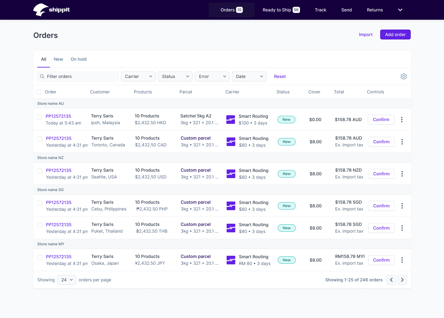


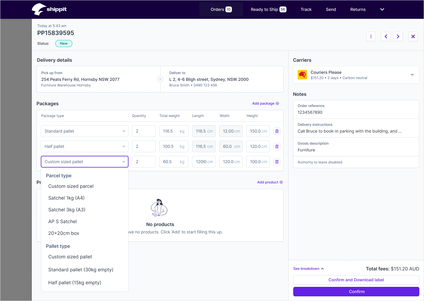
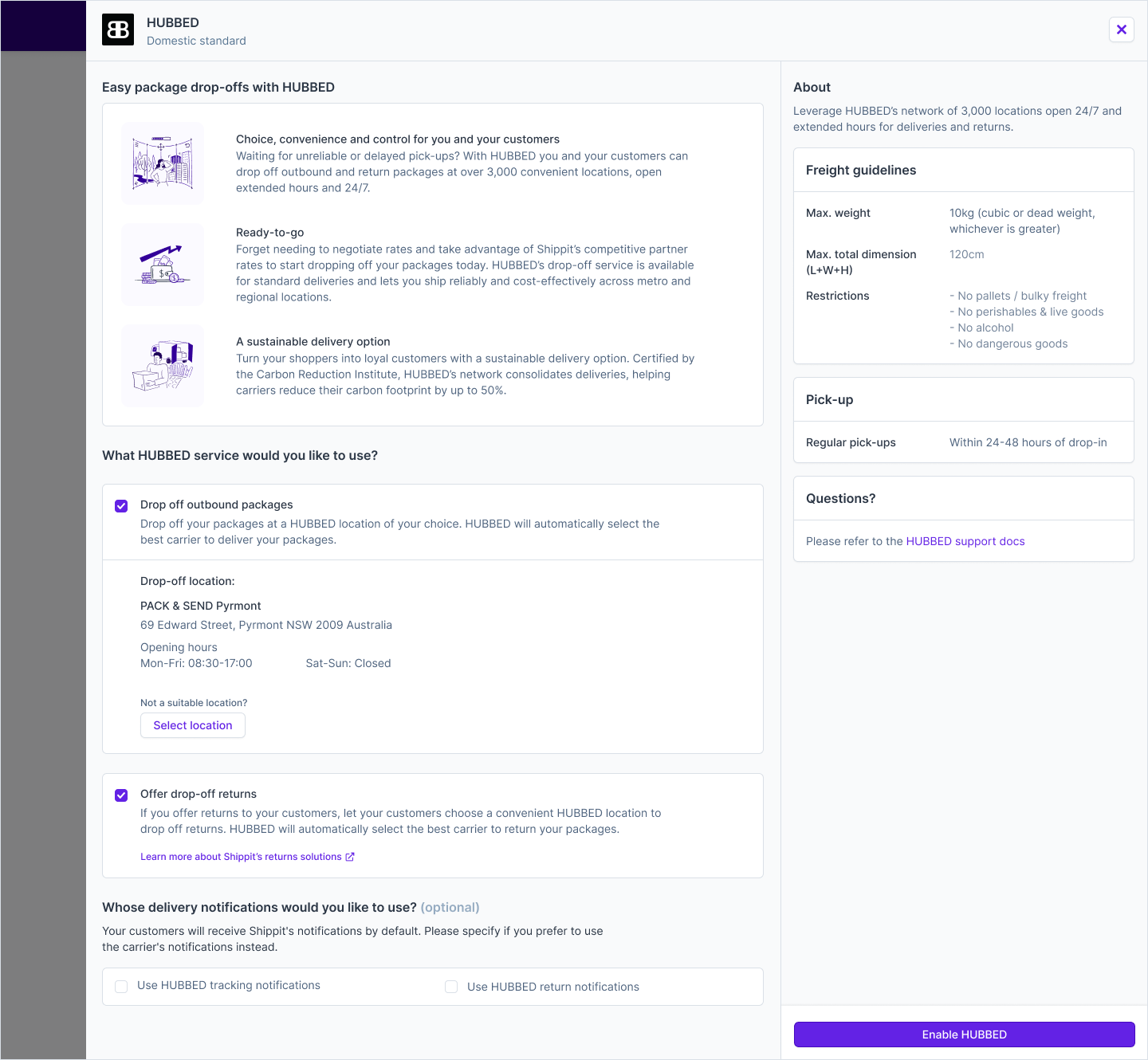
Empowering enterprise users with ease and granularity of automation
As Shippit scaled, so has its customer base and the complexity of their operations. Retailers ship a broad of range of goods (e.g. fragile, dangerous or bulky products) out of different kinds of dispatch locations (e.g. warehouse vs store) using a range of carrier services (e.g. hub & spoke vs point-to-point, same-day / on-demand vs standard) to varying destinations. I worked in the portfolio that owned a suite of carrier tooling aimed to cater to the diverse needs and nuances of senders and recipients.
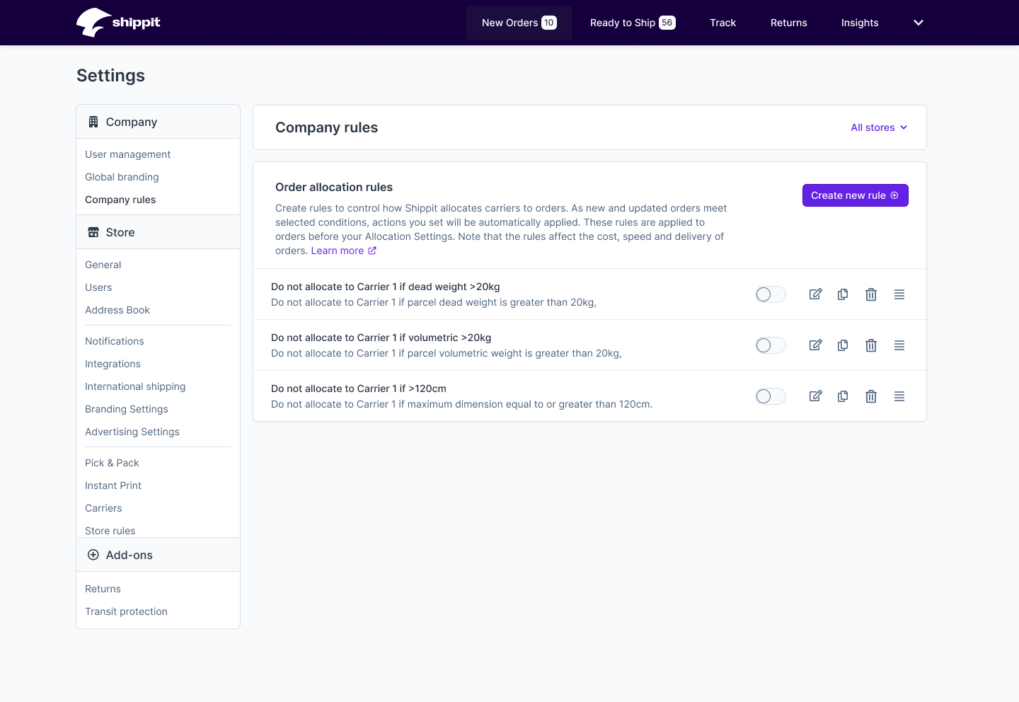
One such tool is the Rules Engine, which allows retailers to create carrier allocation rules based on different attributes of an order. The original proof of concept was in market for a few months. In a focused effort to deep dive on on the configuration and optimisation needs, I researched into light and super users of the tool. After synthesising the findings, and conceptualising the opportunities, I workshopped the order of priorities with the tech team and broader Product org.
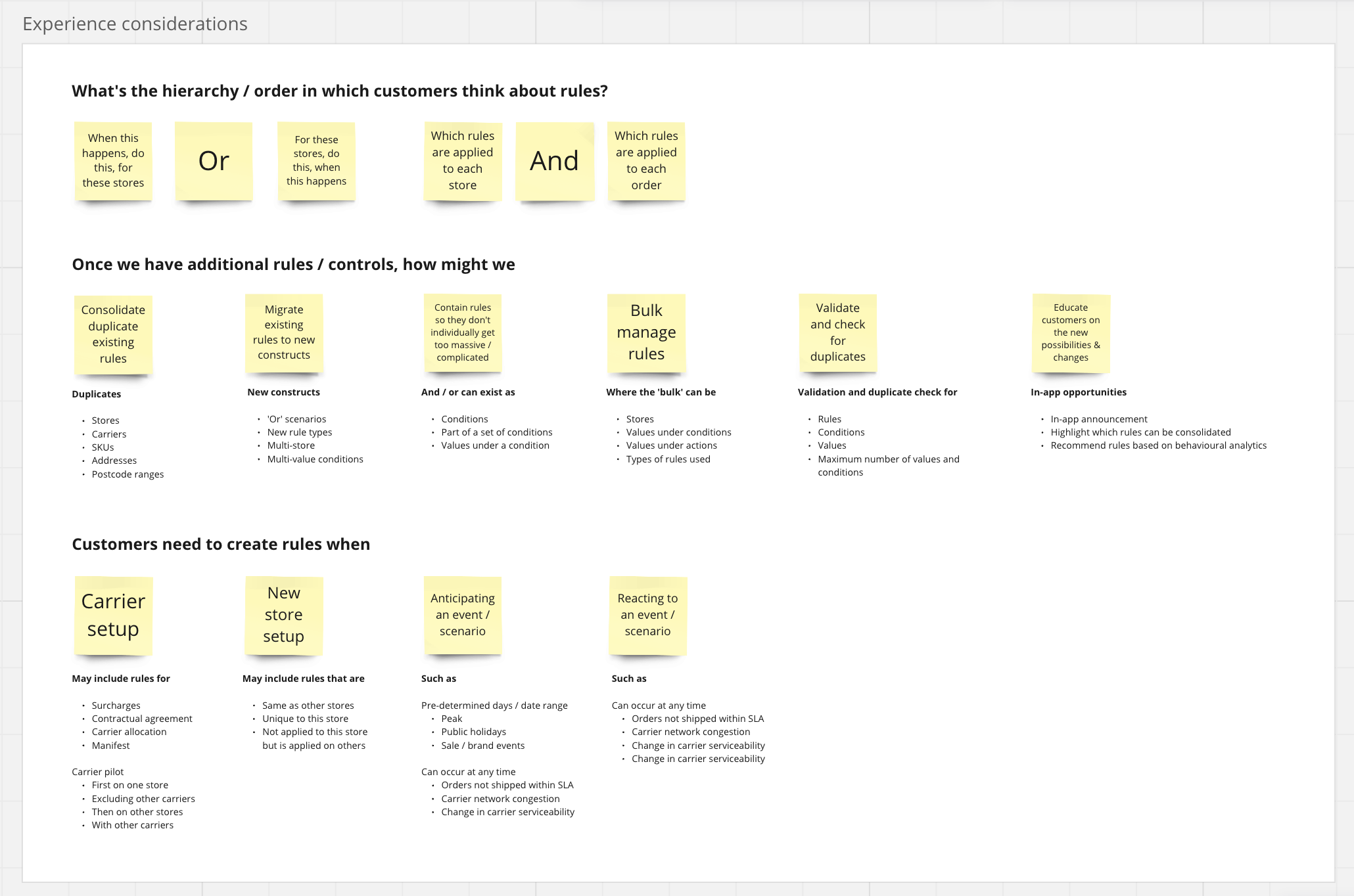
We found that rules as a concept is highly versatile, and has the potential to be applied far beyond its current context of carrier allocation. Extending the capabilities of Rules Engine to affect other forms of preferences using if-this-then-that logic would allow enterprise merchants to set up all kinds of granular control just from using Shippit’s settings UI.
This contributes to the value of Shippit’s software in addition to its vast carrier library, and helps Shippit differentiate from other aggregator platforms in the market.
This contributes to the value of Shippit’s software in addition to its vast carrier library, and helps Shippit differentiate from other aggregator platforms in the market.
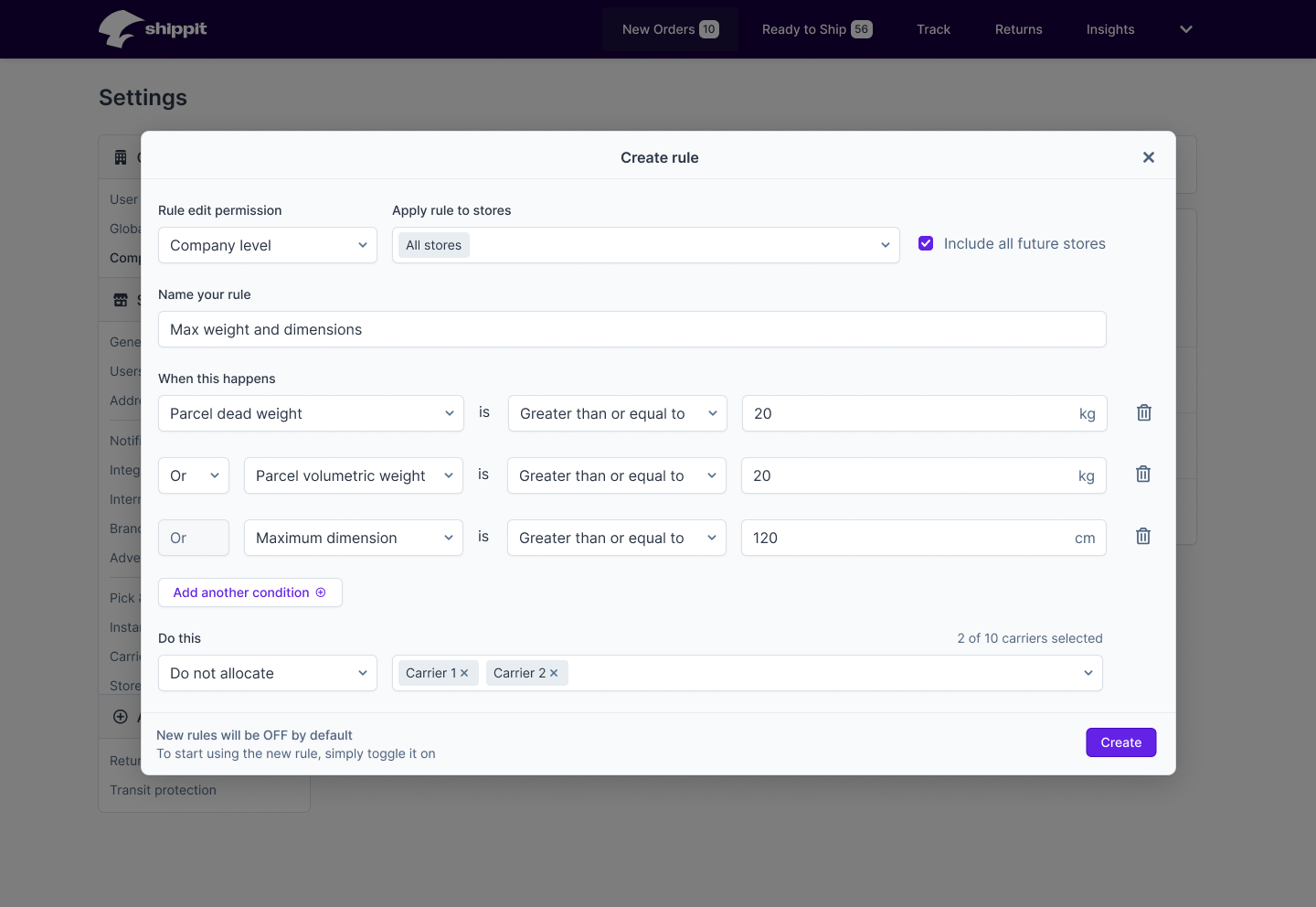
Customer data that showed the vast majority of existing rules had only one condition. Customers explained that this was due to conditions and values only allowing ‘and’ logic but not ‘or’, resulting in the need for customers to create multiple rules to cover the range of a possible scenario. Some customers also told us that they initially expected ‘or’ logic to be applied, only to find out later that the rules they created didn’t work as they thought they would.
As it’s critical for customers to first and foremost create rules that will work as intended, I refined the patterns for rule creation, and worked with the relevent squad to introduce methods of bulk rule creation as the first batch of enhancements.
As it’s critical for customers to first and foremost create rules that will work as intended, I refined the patterns for rule creation, and worked with the relevent squad to introduce methods of bulk rule creation as the first batch of enhancements.


Evolving the design system
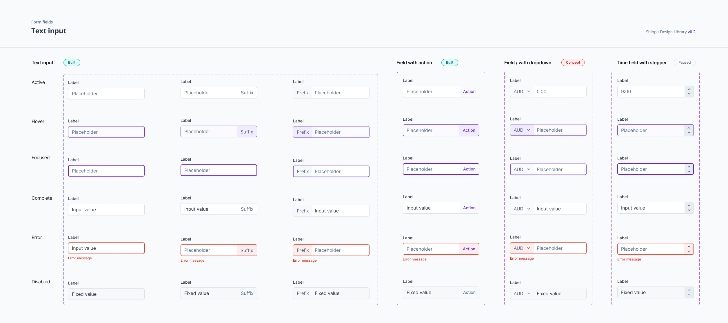
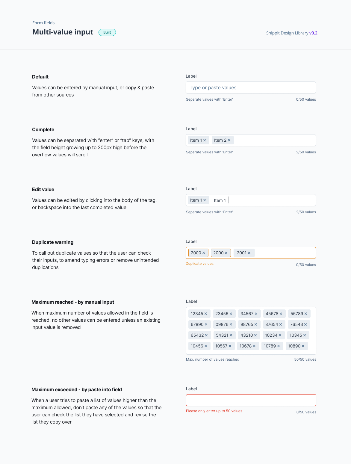
With a small number of designers and an engineering team of full-stack developers, the Shippit design system was managed in a federated model. I drove the recurring cross-functional syncs and documentation, and worked with engineers with front-end interest to prioritise, test and communicate updates across the product and engineering teams.
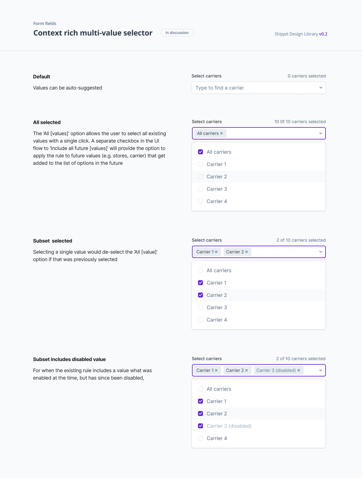
After foundational styles and elements got built, we encountered scenarios where more complex functionalities were required out of a seemingly simple component. For such variants that are rich in context and complex in logic that drives the possible interactions, there were still multiple use cases once a pattern was introduced. These were added to the component library with additional behaviour states.
Visualising insights and simulating impact
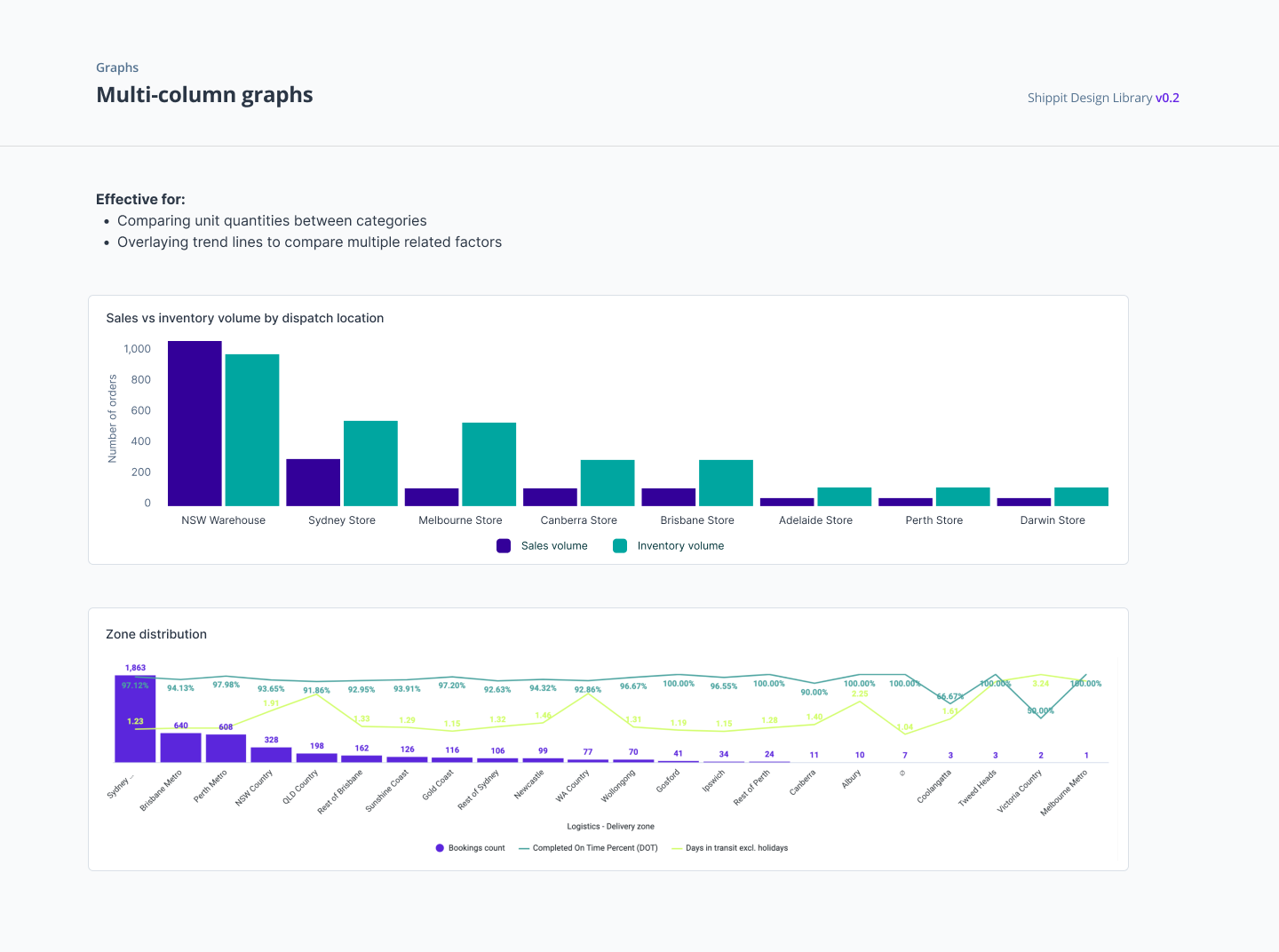
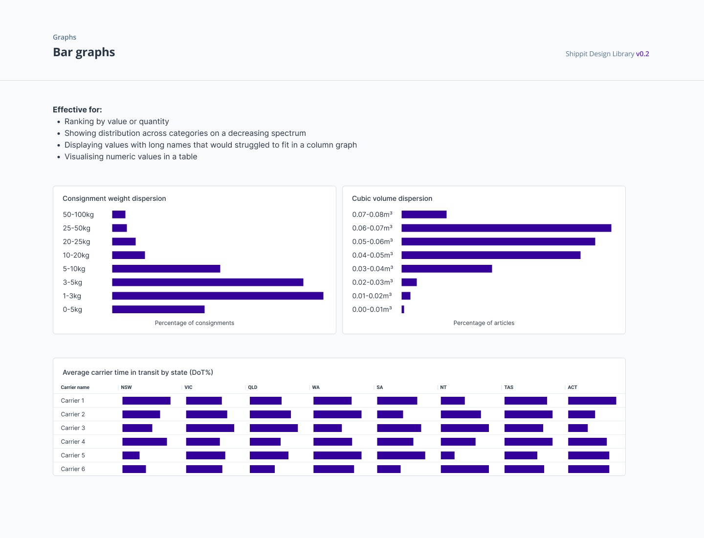
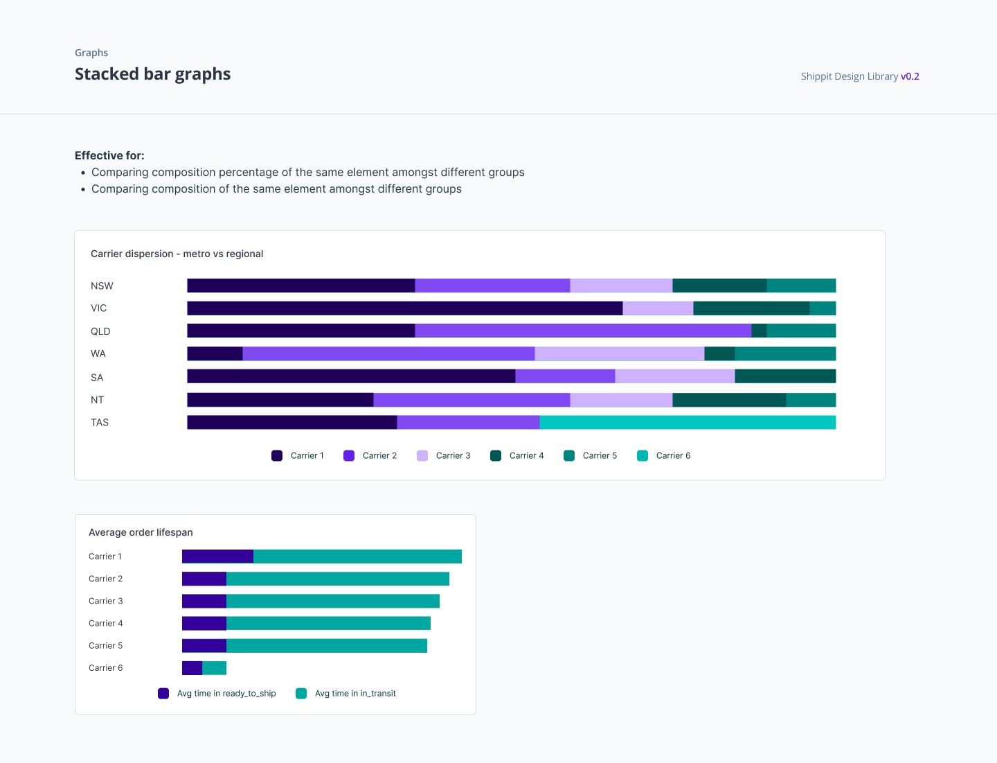
As a platform with two-way integrations into carriers, e-commerce carts and inventory management platforms, Shippit had the potential to be a data rich product not only in automation but also as an insights platform. We created advance reporting aimed to distil actionable insights for customers, which flowed to scenario based simulation for subject matter experts to weigh up strategic decisions.
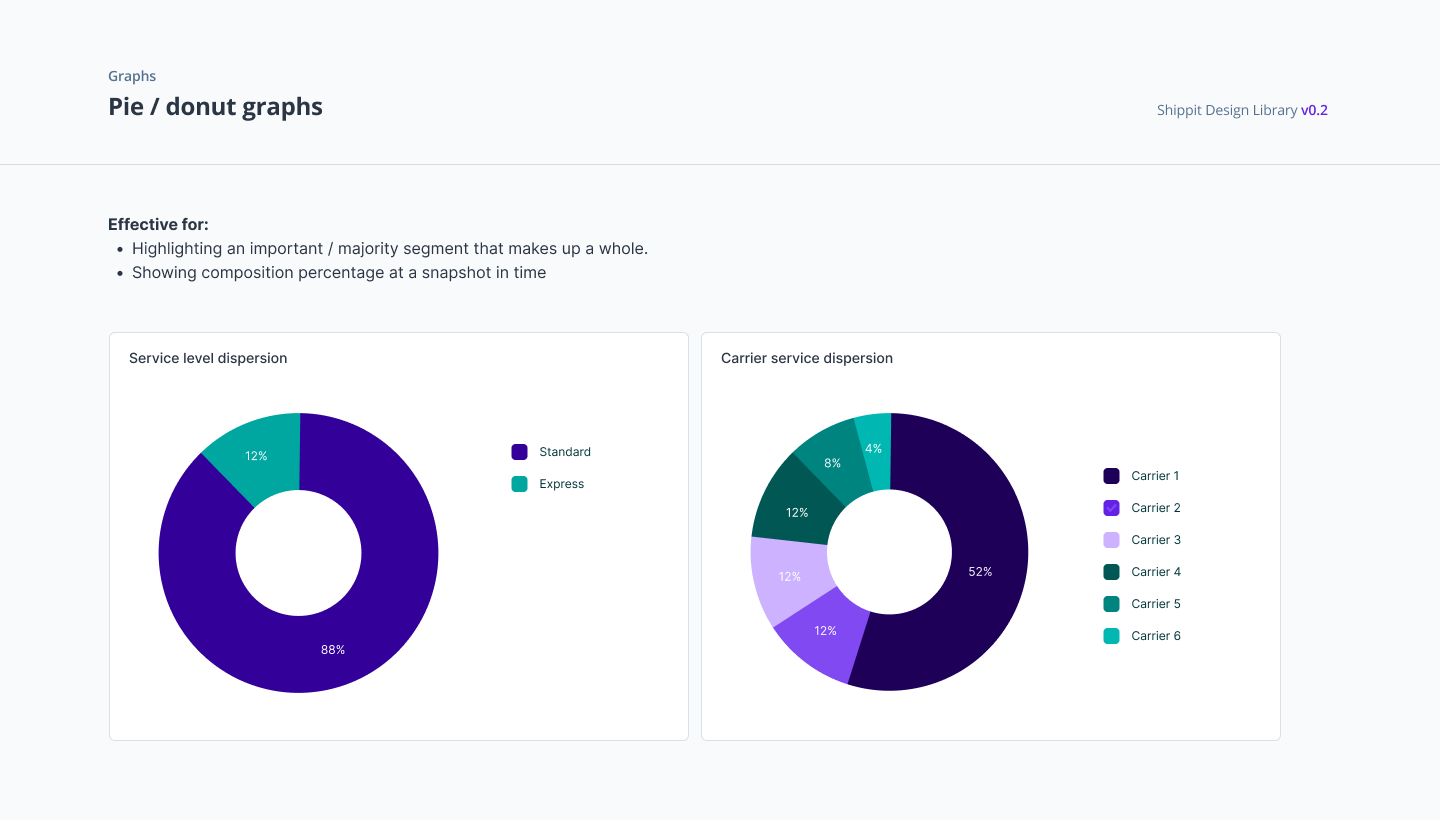
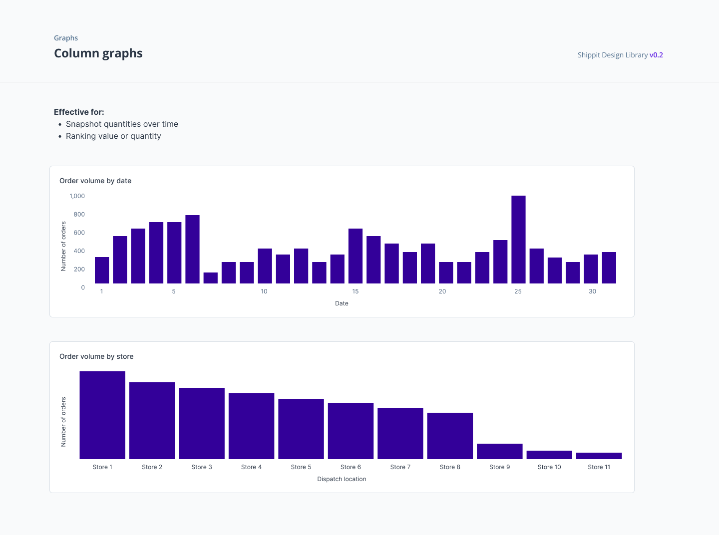
With a range of data tooling in place and visualisation tools chosen to be implemented by the data squad for different internal and expernal users, I also created a platform agnostic set of guidelines to create a level of consistency between different sets of visualisation reports.

Company
Shippit
Shippit
Collaborators
David Landgren
Senior Product Designer
Riel Mosqueriola
Senior Product Designer
Octa Moningka
Senior Product Designer
David Landgren
Senior Product Designer
Riel Mosqueriola
Senior Product Designer
Octa Moningka
Senior Product Designer