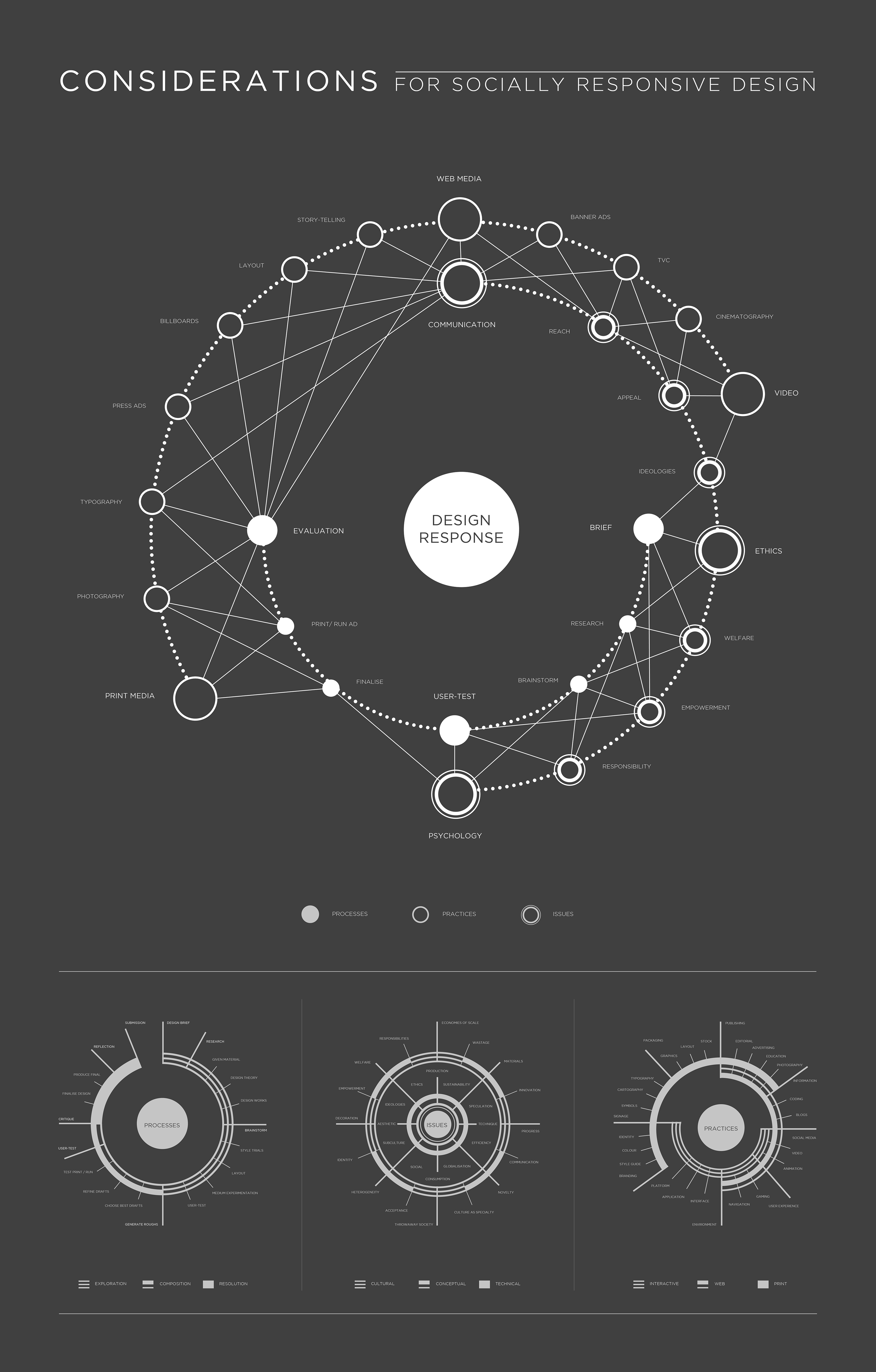
Considerations for socially responsive design
Visual mapping | Information designThese image maps were designed to visualise what I understood about the design industry as a second year design student, prior to researching a more specific focus question on the considerations for socially responsive design.
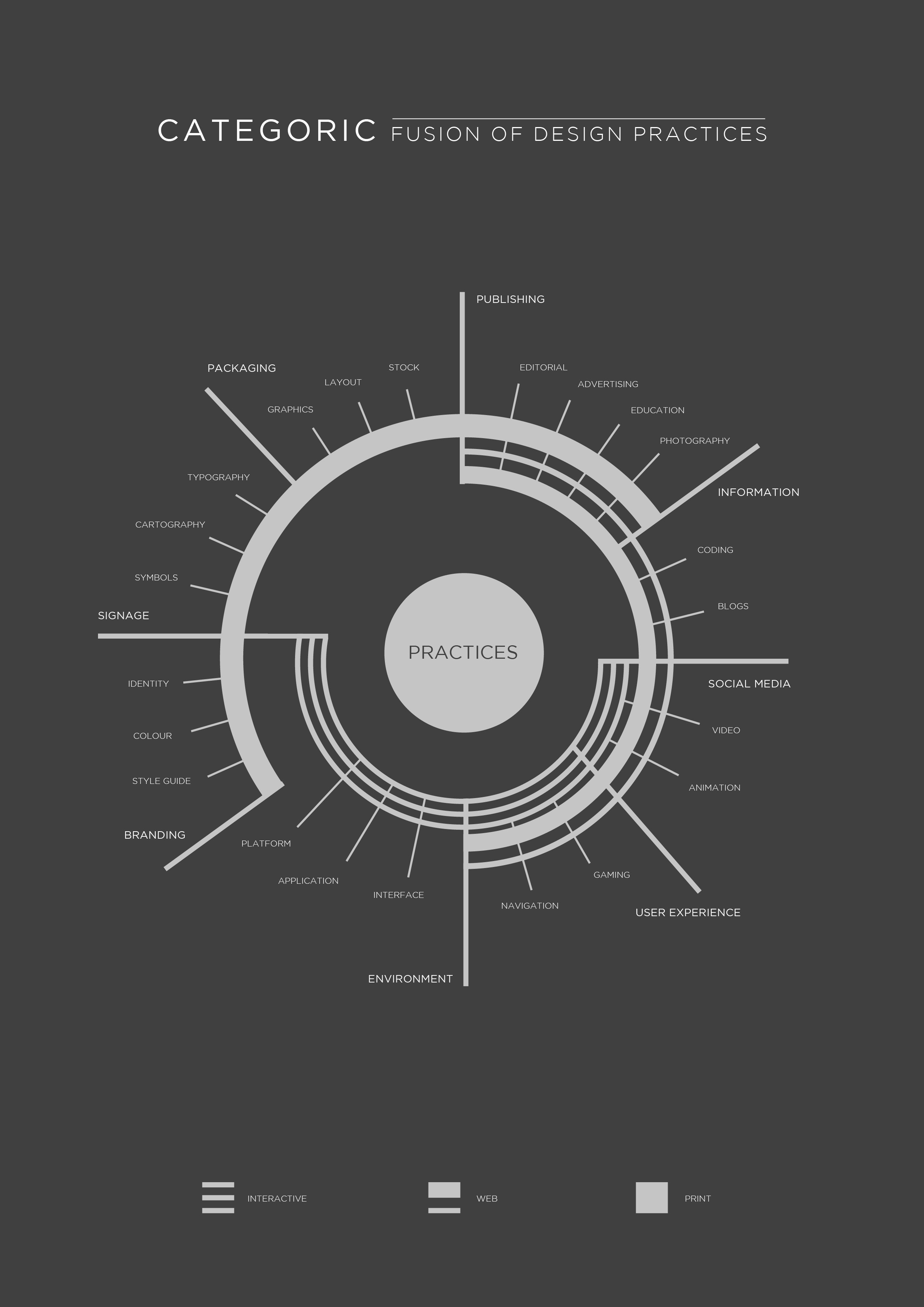
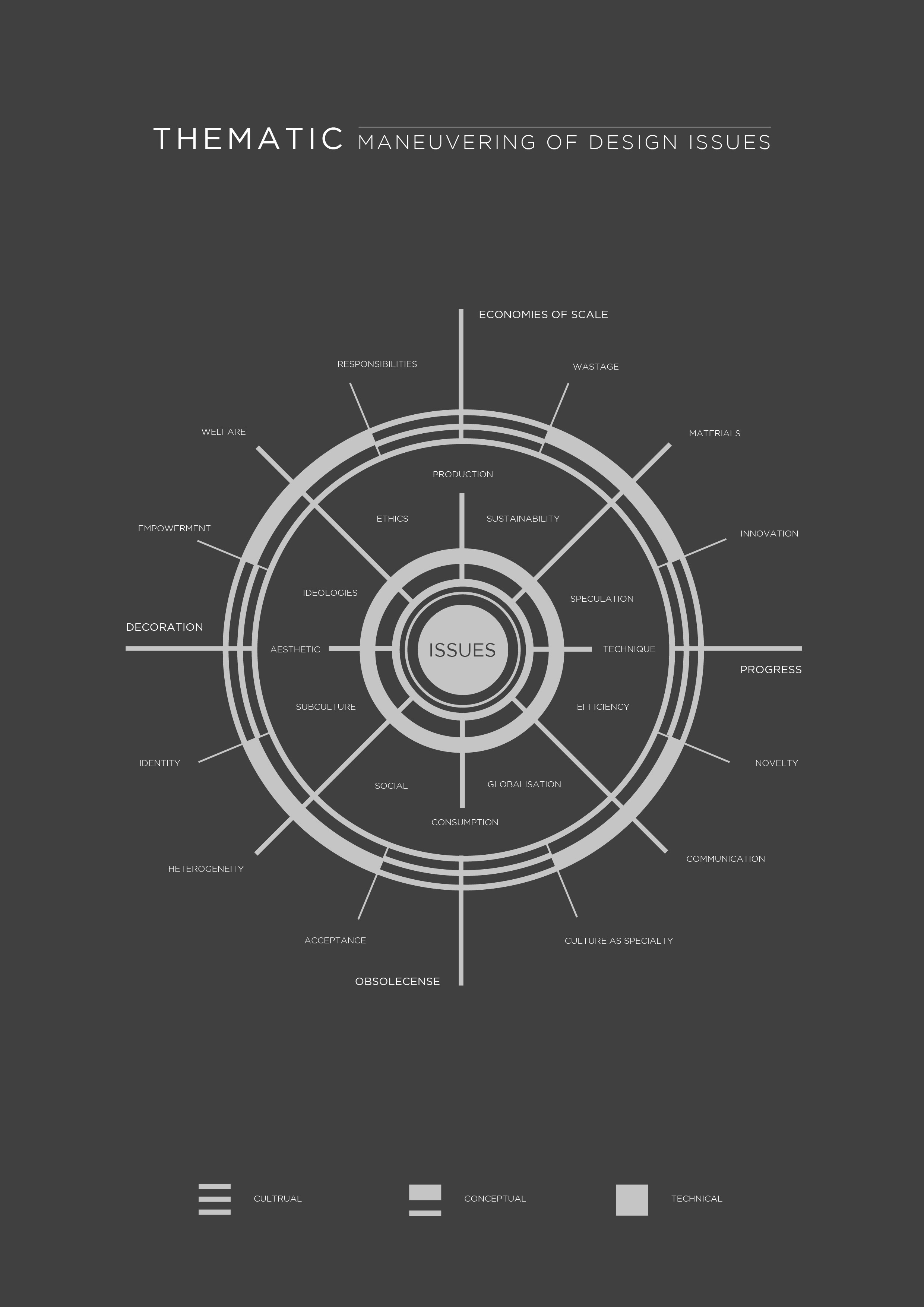
Starting with a linear trail of the design process, a categorically divided map of design practices and a thematic web of some key design issues, the map present a general view of design as I came to understand it after two years of study. These ideas are articulated by three types of strokes for the three high-level areas of each field: the solid line for the most established or concrete; thick-thin double stroke for aspects still very much expanding; and the thin triple stroke for the most emergent and volatile of the three.
Starting with a linear trail of the design process, a categorically divided map of design practices and a thematic web of some key design issues, the map present a general view of design as I came to understand it after two years of study. These ideas are articulated by three types of strokes for the three high-level areas of each field: the solid line for the most established or concrete; thick-thin double stroke for aspects still very much expanding; and the thin triple stroke for the most emergent and volatile of the three.
The final map draws on the fruition of the three initial maps to produce a visualisation that expressed my preconceived idea what processes, practice and issues are involved, and how these overlap and relate to each other.
All maps are grey on grey as they are only rough representations of what my perceptions were during the few weeks of doing the project, and my perception of design is constantly subject to change and can never be truly expressed through any specific colour.
All maps are grey on grey as they are only rough representations of what my perceptions were during the few weeks of doing the project, and my perception of design is constantly subject to change and can never be truly expressed through any specific colour.