icare self service tools and design system
UX & UI | Product design
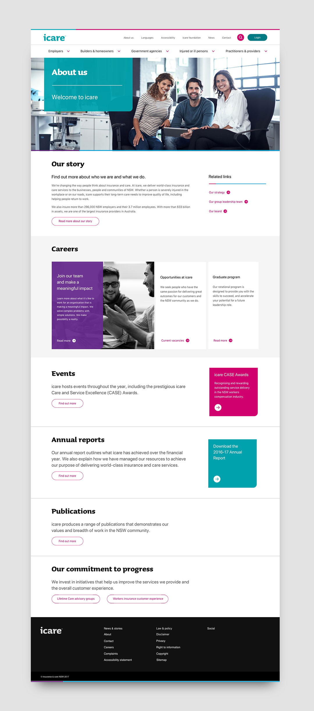
The combined body of five separate organisations, icare was formed in 2015 to provide insurance
and care services to businesses in New South Wales. Deloitte Digital worked
alongside them in their digital transformation program, starting with a new
website for this new organisation.
After the website first launched, I went
into the program as Creative Design Lead in a placement of eight months, first
to work on a suite of enhancements to the website, then a range of other online self service tools for different service lines. In this period we established a design
system that allowed the business to scale their digital offerings with
increased efficiency, which ultimately lead to the creation of a living
experience language guide.
Catering for diverse government agencies
The icare Insurance for NSW scheme provides self insurance
to NSW Government Agencies. Hence the users are a small, diverse but highly
specialised group of people that come into the portal to fulfil very specific
roles for a very particular kind of organisation. Flexibility was key to
designing this one-stop-shop for government agencies, and over 4 main releases we
introduced more roles, permissions and functionalities to power users
and new starters alike.
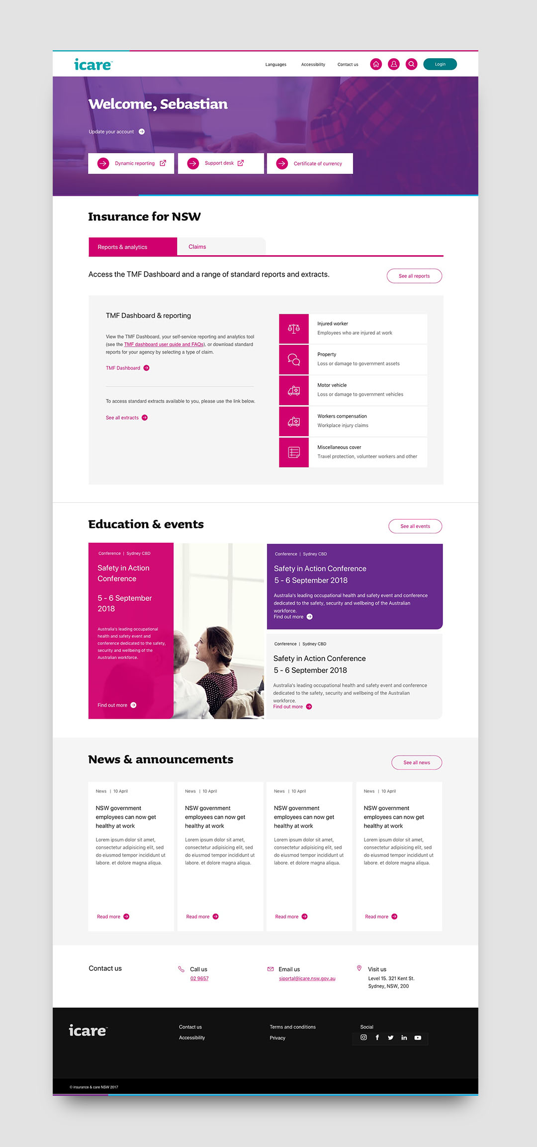
Foundationally, we opted for a dynamic dashboard, with
conditional visibility based on roles that surfaced only relevant modules and
functionalities for each role. The dashboard served as a springboard into many
deeper flows, some of which were single-sign-on onto other platforms, and some
carried out in the portal itself. We omitted a global menu from this portal as
each functionality only went two layers under the dashboard, and every feature
relevant to a role is accessible via the dashboard itself. Some key features we
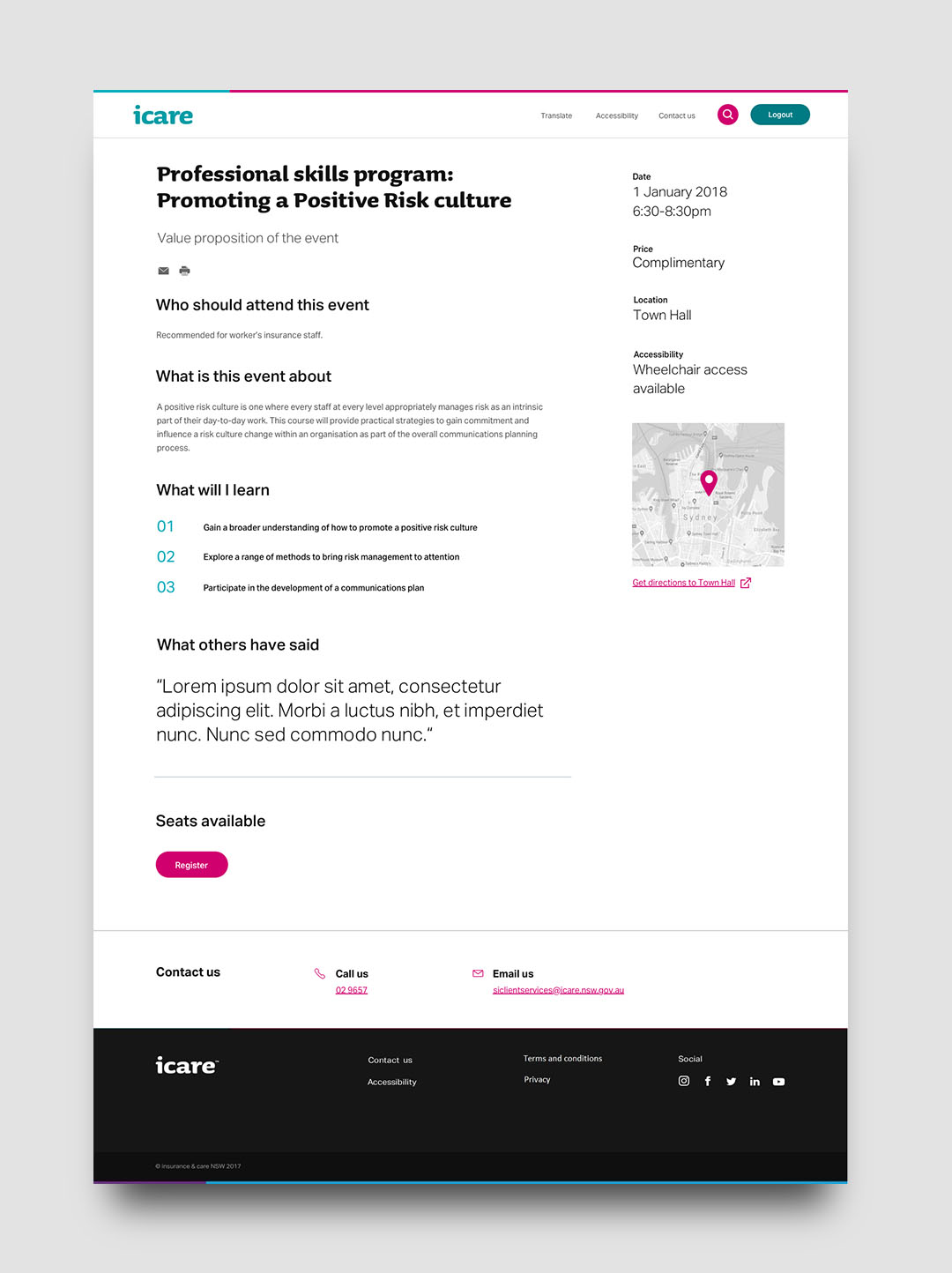
designed in the initial releases of the portal included events, quote and
application for a construction risk policy.
Facilitating industry
insights
As a state government service provider, icare collects and
analyses a broad range of data in order to improve their initiatives and share
insights. While these insights were shared as static content and reports in the
past, there was appetite and desire for an interactive tool, with which
different audiences from brokers to unions can look for their own insights by
comparing and looking deep into the data, at the level that is relevant for
them.
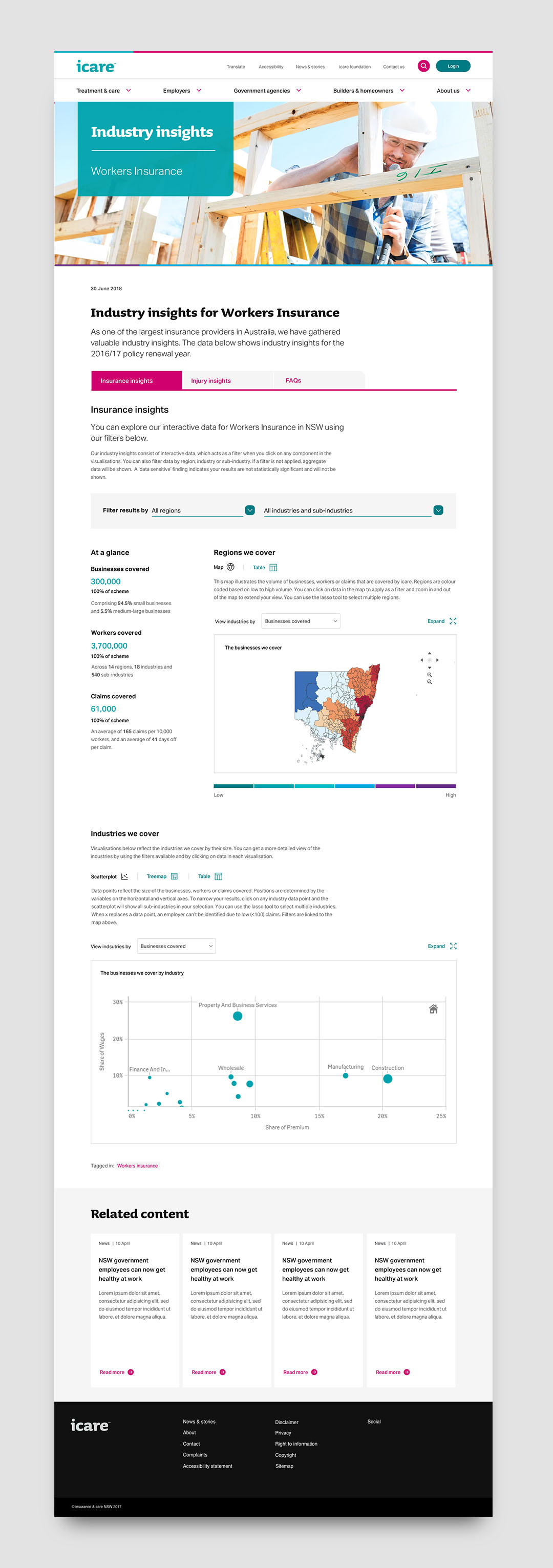
The Industry Insights tool for the Workers Insurance scheme
was a first step down this path, integrating their Qlik Sense reporting tool
into the website to provide interactive visualisations driven by multi-layered
filtering. As the public audience that would come to this tool may scan, browse
or deep dive into the data, content drives the interactions and was chunked
according to the level of detail that the user may go into.

Empowering injured workers and their employers
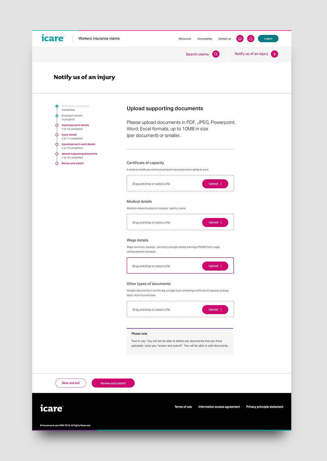
After the launch of a digital Workers Insurance claims
application form, we worked on a self-service portal for tracking and managing
claims for both injured workers and employers. With an iterative process that
tested high-level concepts, detailed features and usability, the tool was
designed to instill a peace of
mind for people who need to experience a workplace injury claim.
Adjusting views for different roles that possess different
levels of access, the product was geared to make injured workers feel confident
about the their path to recovery, but also give employers the satisfaction of
knowing their losses are covered. Roles ranged from return to work
coordinators, human resources and payroll in an employer organisation, to injured workers that experienced light
to severe injuries.
Maturing the design
system
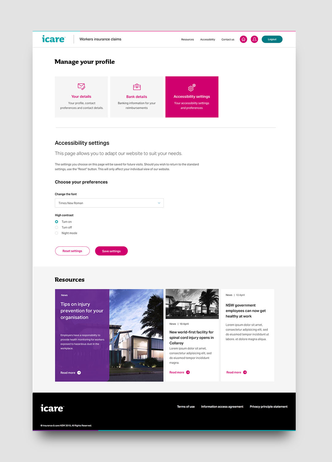
While the website launched successfully with a
collection of components, the functional needs of portals and new website
features required enhancing the existing components and the creation of new
ones. This happened organically as new projects came into production, with
every stream feeding into the library and pulling through the same shared
features. The federated model for building icare’s design system allowed teams
to share both design and development effort along the release schedule, and
added flexibility for modules to be updated along the release train when
required.
The business has since started to internalise more capabilities
such as design and development, and build their own teams to continue the
scaling of icare’s digital offerings. To ease this transition and provide a
platform that will reach out to the digital service community in general, we
proposed a living guideline to house both the knowledge and the assets for
creating and updating products.
Client
icare
Agency
Deloitte Digital
icare
Agency
Deloitte Digital
Collaborators
Ema Karavdic
UX design lead
John Daniel Rhys Mirabell
UX designer
Marina Boutros
UX designer
Minnie Zhu
UX designer
Jeanne Tian
UX designer
Carrie Webster
UX designer
Alexia Combet
Strategist
Ema Karavdic
UX design lead
John Daniel Rhys Mirabell
UX designer
Marina Boutros
UX designer
Minnie Zhu
UX designer
Jeanne Tian
UX designer
Carrie Webster
UX designer
Alexia Combet
Strategist